Startup Brand Identity Checklist: What You Need at Launch

In short
- At launch you need a clear name and story, a logo that works small, a type and colour system, one graphic idea, the product in the brand, a website and a deck.
- Social templates, merchandise and a large guidelines book can wait.
- Launch everything on the same day, so every place people find you looks like the same company.
Contents (15)
Launching a startup means launching a brand in many places at once: the website, the product, the deck, social profiles, the announcement post and the email signature. If some of these are missing or do not match, the launch looks unfinished.
This checklist covers what a startup brand identity needs at launch, in the order we usually build it at Second Eight. Use it to plan the work and to check nothing is missing before launch day.
1. Strategy and story
Before anything visual, write down:
- What the company does, in one sentence a non-expert understands
- Who it is for: the first customers, and the investors you are talking to
- What makes it different, in a few short points
- How the brand should feel: two or three words, such as precise, warm or calm
Everything else is built on this. If the team cannot agree on the one sentence, the website and the deck will not agree either.
2. Name
- The name, easy to say and spell
- Trademark check in your main markets, done with a lawyer
- Domain and social handles secured
- A short story for where the name comes from, if it has one
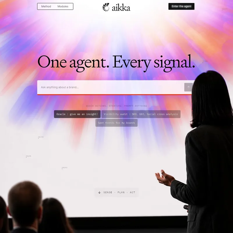
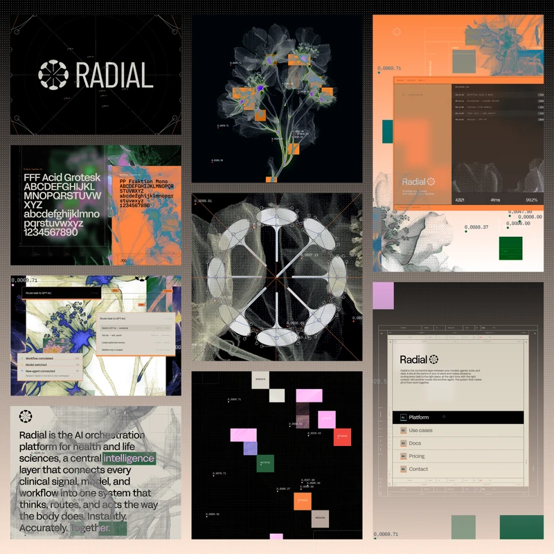
Some companies arrive with a name. Aikka.ai, a Paris-based AI company building the operating system for pharma commercial teams, already had its name. It means seashell, and the logo was built around it. If you need a name, see how to name a startup.
3. Logo
- Primary logo: symbol and wordmark
- Symbol alone, for small spaces
- App icon and favicon, tested at real size
- Versions in colour, black and white
- Clear space and minimum size rules
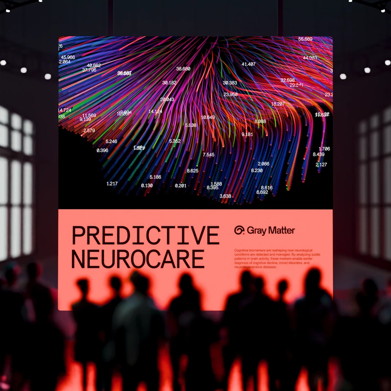
The logo should come from one idea that is simple to explain. Gray Matter, a neuroscience company focused on predictive neurocare, has a logo that combines the form of a brain with the letter G. Sixfold, an AI company for research, is named after the hexagon's symmetry, and its logo is that grid made visible. Check it as a browser tab and an app icon before you approve it. More on this in our guide to logo design for tech startups.

4. Typography
- One or two fonts, with licences for web, app and print
- A type scale for headlines, body and labels
- A fallback font for tools without the brand fonts


Not sure your brand is working?
I'm Sam, founder of Second Eight. I design brands for AI, tech, science and health companies, so I know what investors and customers read in a brand before they read anything else. Send me your website and deck, and I'll tell you what works, what's holding you back and what I'd change. You get a one-page scorecard and a 30-minute call with a straight answer: keep it, fix it or rebuild it.
5. Colour
- Main colours and accents, with HEX, RGB and CMYK values
- Usage rules: which colour leads and how much of each to use
- Contrast checked for text on every background you use
- Product colours for states, alerts and charts
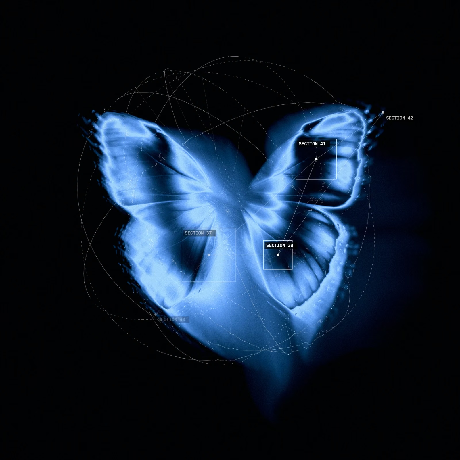
Colour can also say something about the company. Gray Matter's brand does not use gray. Its colours are bright and taken from data visualisation. Sixfold's palette is a deep blue thermal gradient over near black.
6. Graphic language
- One main graphic idea, connected to what the company does
- A few ready-made graphics for the website, deck and social posts
- Secondary versions for small or simple uses
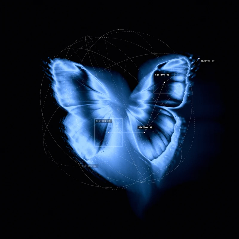
This is what makes the brand recognisable without the logo. Sixfold's graphics are built from thermal imagery: specimens seen as heat, sectioned and numbered. Gray Matter's graphics come from the brain's structure and mathematical mapping, built with nodes and procedurally generated. Aikka's graphics draw on biological, floral, chemical and physical structures, each drawn by hand and paired with technical elements.
7. Product UI
- Core screens in the brand: sign in, home, the main feature
- Components: buttons, inputs, cards
- Icons in the brand style
- Basic motion rules
For most tech and health startups, people spend more time in the product than anywhere else. Gray Matter's UI is minimal, with strong typography, clean layouts and subtle motion.
8. Website
- Homepage that says in one sentence what the company does
- Product or how it works page
- About or team page
- Contact or waitlist
- Legal pages: privacy and terms
- Social sharing image and page titles set for search
A launch website can be small. Four or five clear pages are better than fifteen unfinished ones.
9. Pitch deck
- A send version that reads on its own
- A presenting version with fewer words
- Built from the brand system: fonts, colours, graphics and grid
See pitch deck design for startups for the details.
10. Motion and launch content
- Logo animation, for the website, social posts and videos
- A short launch film or a few animated graphics
- The launch post with images in the brand
Motion helps a launch post stand out, and it shows the product working. Sixfold's motion is slow and physical: heat spreads, cools and settles. Aikka's motion and UI are subtle and soft.

11. Everyday basics
- Social profile images and banners
- Email signature
- Document template for proposals and reports
- Business cards, if you meet people in person
12. Guidelines and files
- Short brand guidelines covering the items above
- All source files in one shared place
- Templates for the deck and social posts
Read more in brand guidelines for startups.
What can wait
Not everything has to be ready on day one. These can come later:
- Merchandise and event materials
- A large photography library
- Detailed guidelines for print, packaging or signage
- A full content and social plan
- Brand rules for teams and products you do not have yet
Launch on one day
Plan the website, product, deck, social profiles and announcement for the same day. A new logo next to an old website, or a new website with an old deck, makes the company look unready. When everything changes at once, the launch feels like one clear event.
Questions
A clear one-sentence story, a name, a logo that works small, typography and colour rules, one graphic idea, the product UI in the brand, a launch website and a pitch deck. Motion and short guidelines help a lot. Most other things can wait.
Strategy and the one-sentence story first, then the name, then the logo, type, colour and graphics. After that, the product UI, the website and the deck, built from the same system. Guidelines come last, once the system is decided.
A focused identity project usually takes a few weeks. Adding naming, a website and product UI takes longer. Plan backwards from your launch or fundraising date and agree the scope before you start.
Yes, if the basics are solid: a good name, a clear logo and consistent type and colour. A simple brand used consistently works better than a complex one used badly. Plan a fuller identity when the company reaches its next stage.
Not sure your brand is working?
I'm Sam, founder of Second Eight. I design brands for AI, tech, science and health companies, so I know what investors and customers read in a brand before they read anything else. Send me your website and deck, and I'll tell you what works, what's holding you back and what I'd change. You get a one-page scorecard and a 30-minute call with a straight answer: keep it, fix it or rebuild it.