Pitch Deck Design for Startups: What Investors Notice

In short
- Investors read a deck fast. Design it so each slide makes one point they can take in at a glance.
- Show the real product. A clear screen tells them more than a paragraph about it.
- Build the deck from your brand system, so the deck, the website and the product look like one company.
Contents (9)
A pitch deck is often the first thing an investor sees from your company. Many of them will read it alone, on a laptop or a phone, before they ever speak to you. The design decides whether they can follow your story in that first pass.
This guide covers what to design for, slide by slide, and how a brand system makes the deck easier to build and easier to read. The examples come from brands we designed at Second Eight.
Design for the first read
Investors see many decks. They look for a few things quickly: what the company does, why it matters now, who is building it and what you are asking for. Good design makes those things easy to find.
- One idea per slide. If a slide needs two headlines, it is two slides.
- The headline says the point. Write "Our customers reorder every month", not "Traction". The reader should get the slide from the headline alone.
- Large type. A deck is often read on a small screen. Body text that looks fine on a monitor can be unreadable on a phone.
- Few words. Keep the details for the call or the appendix.
- A clear order. Problem, product, market, business model, team, the ask. Investors know this order, so they do not have to search.
Say what the company does in one sentence
The first slides should tell a non-expert what the product does. Complex science and AI companies find this hardest, and it matters most for them.
Sixfold is an AI company for research. Its description is plain: it reads what instruments see (microscopy, thermal, spectral and sensor streams) and returns the parts, the numbers and the links between them. On its stage screen the line is short: "Every frame, sectioned and read." A sentence like that works as a deck title.
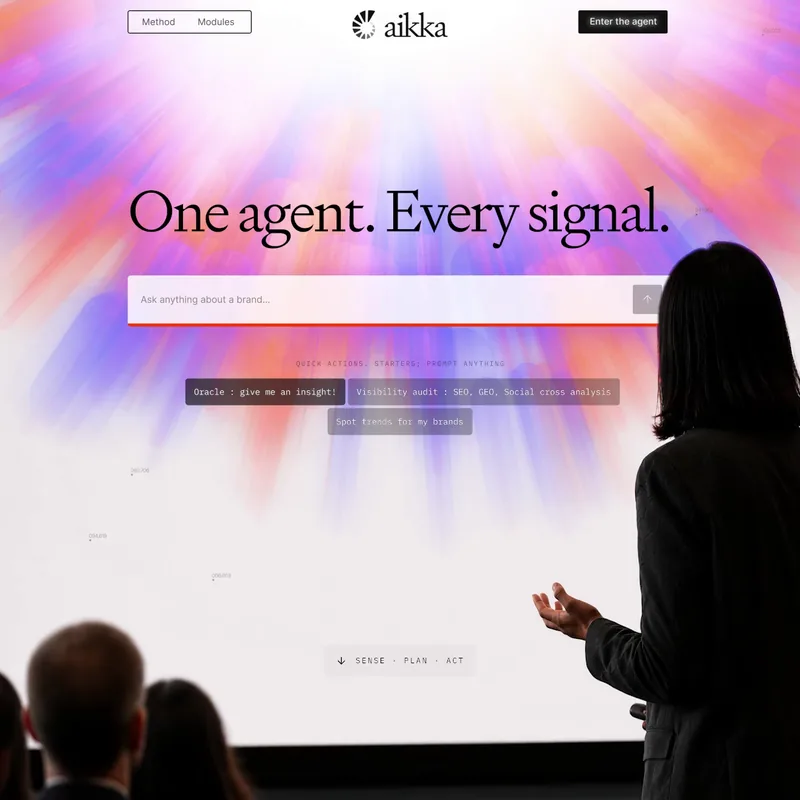
Aikka.ai builds the operating system for pharma commercial teams. Its website leads with "One agent. Every signal." The same line can open a deck, because it is already the company's own words.
If you cannot write that sentence yet, fix it before you design anything. No layout can make an unclear idea clear.




Not sure your brand is working?
I'm Sam, founder of Second Eight. I design brands for AI, tech, science and health companies, so I know what investors and customers read in a brand before they read anything else. Send me your website and deck, and I'll tell you what works, what's holding you back and what I'd change. You get a one-page scorecard and a 30-minute call with a straight answer: keep it, fix it or rebuild it.
Show the product, not a description of it
A product slide with a real screen shows that the product exists and how it works. Use clean screenshots or designed product views, cropped to the part that matters.
- Show one screen per slide, large.
- Add a short label that points to what the reader should notice.
- If the product is early, show a designed prototype and say that it is one.
- Avoid stock photos of people at laptops. They say nothing about your company.
For a deep tech or science company, a simple diagram often works better than a screen. Tessel, a cell banking brand and a studio project of ours, uses a "How it works" slide with three steps: consultation, collection and processing. Three steps, one line each, is enough for a reader to understand the service.
Use the brand system, not a template
A deck built on a generic template looks like every other deck. A deck built from your brand system looks like your company, and it is faster to make because the decisions are already made.
The parts of the brand that carry into a deck:
- Typography. Use the brand fonts with set sizes for titles, body and labels. Tessel uses two fonts, one weight each. That rule keeps every slide calm and consistent.
- Colour. Use the main palette for backgrounds and type, and keep accent colours for what you want people to notice.
- Graphics. The brand's own graphics make title and section slides recognisable. Sixfold's stage screens use its thermal imagery. Tessel's keynote slides use its outline cell mark.
- Grid. A fixed grid keeps titles, images and numbers in the same places from slide to slide.
When the deck, the website and the product share one system, an investor who clicks through from the deck to the site sees the same company. That consistency is part of what makes a young company look considered.

Make numbers easy to read
Numbers are where many decks lose readers. Keep charts simple.
- One chart per slide, with the takeaway written as the headline.
- Label the axes and units.
- Use one colour for your company and a neutral grey for everything else.
- Round numbers where precision does not matter.
- Never stretch an axis to make growth look bigger. Investors notice.
Make two versions
A deck has two jobs, and one file rarely does both well.
- The send version is read alone. It needs full headlines and enough text to stand on its own.
- The presenting version is shown behind you while you talk. It needs fewer words, larger images and more pauses.
Keep both in the same system so they look like the same deck. Export the send version as a PDF with a reasonable file size, and check it on a phone before you send it.
The team and the ask
Two slides that are often rushed:
- Team. Use consistent photos, cropped the same way, with one line on why each person fits this company. Mismatched photos make a team look less organised than it is.
- The ask. Say how much you are raising and what it will pay for, in a few clear points. Put it near the end, on its own slide.
When to get a designer
A founder can build a clear deck in a slide tool with good brand files. A designer helps most when:
- You are raising a larger round and the deck will be read by many investors.
- The brand is new or does not exist yet, so the deck has no system to build on.
- The product is hard to show, and you need diagrams or product views made for it.
We often design the pitch deck as part of a brand identity project, so the name, the identity and the deck are made together and ready at the same time. See also our guides on AI startup branding and when to rebrand a startup.
Questions
There is no fixed number. Ten to twenty slides is a sensible range for a seed deck. The right number is the fewest that tell your story clearly: what you do, why now, the product, the market, the business model, the team and the ask. Put extra detail in an appendix.
It is better to have at least the core brand first: the name, the logo, the fonts and the colours. The deck can then be built from that system. If you need a deck urgently, keep it simple and redo it once the brand is ready.
Usually what the company does, the team and the ask. Make those easy to find, with clear headlines and a familiar order, so a reader gets them in the first pass.
Yes. A branding agency can design the deck as part of a brand project, so it uses the same typography, colour and graphics as the website and the product. You keep editable files so the team can update the numbers between meetings.
Not sure your brand is working?
I'm Sam, founder of Second Eight. I design brands for AI, tech, science and health companies, so I know what investors and customers read in a brand before they read anything else. Send me your website and deck, and I'll tell you what works, what's holding you back and what I'd change. You get a one-page scorecard and a 30-minute call with a straight answer: keep it, fix it or rebuild it.