Brand Guidelines for Startups: What to Include

In short
- Brand guidelines are the rules that let anyone on the team use the brand correctly without asking the designer.
- For a startup, keep them short: the idea, the logo, type, colour, graphics, the product and a few templates.
- Clear rules with real examples are worth more than long explanations.
Contents (10)
A startup brand is used by many people at once: founders making decks, engineers building the product, a freelancer making social posts, a partner printing a banner. Without rules, each person makes their own choices, and within a few months the brand looks like several companies.
Brand guidelines prevent that. They do not need to be a large book. For a startup, a short, clear document with the right files is enough. This is what we include in the guidelines we deliver at Second Eight.
1. The idea
Start with one page that explains the brand in plain words:
- What the company does, in one sentence
- The idea behind the identity
- Where the name comes from, if it has a story
This page matters because it helps people make good choices in situations the rules do not cover.
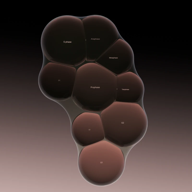
Tessel, a cell banking brand and a studio project of ours, has a clear one-page idea. The concept comes from G0, the resting state of a cell: alive, but not dividing, held still until it is needed. The name comes from tessellation, shapes fitting together with no gaps, the way cells form tissue. Anyone who reads that knows why the brand looks calm and still.
2. The logo
The logo section should answer every question someone might have before they place it.
- Versions: primary, stacked, symbol alone
- Colour versions: full colour, black, white
- Clear space: the empty area around the logo, usually measured with a part of the mark itself
- Minimum size, for print and for screens
- Construction: how the mark is drawn, so it is never redrawn by hand
- Misuse: a few examples of what not to do, such as stretching, recolouring or adding effects
The Tessel logo is a hand-drawn mark of three cells held inside a soft skin. Its construction drawing shows the outline with its construction points and guide lines, so the mark stays the same wherever it is used.
Radial, an AI startup building an orchestration platform for health and life sciences, has a mark of eight stems. Seven follow the pattern and one breaks from it. A rule like that has to be written down, because someone redrawing the mark could easily "fix" the eighth stem.




Not sure your brand is working?
I'm Sam, founder of Second Eight. I design brands for AI, tech, science and health companies, so I know what investors and customers read in a brand before they read anything else. Send me your website and deck, and I'll tell you what works, what's holding you back and what I'd change. You get a one-page scorecard and a 30-minute call with a straight answer: keep it, fix it or rebuild it.
3. Typography
Name the fonts, say where each one is used and set the sizes.
- The title font and the body font, with weights
- A type scale: sizes for headlines, subheads, body text and labels
- Line spacing and letter spacing for each size
- Which fonts to use in tools without the brand fonts, such as email or slide software
- Where to get the licences
Fewer fonts make the rules easier to follow. Tessel uses two fonts, one weight each: titles in Martina Plantijn, paired with one sans. Radial uses two typefaces, FFF Acid Grotesk and PP Fraktion Mono.

4. Colour
List every colour with its values for screen and print: HEX, RGB and CMYK, and Pantone if you print often. Then write how the colours are used, not only what they are.
- Which colours are main and which are accents
- How much of each colour a layout should have
- Which combinations pass contrast checks for text
- Colours for the product, such as states, alerts and charts
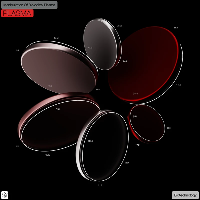
Usage rules are what keep a palette consistent. Tessel's palette runs from deep black into warm mauve and soft pink, and terracotta, clay, violet, cyan and red appear only as small accents. Plasma, a blood diagnostics company, uses red as the only colour in its interface palette. A one-line rule like that is easy for everyone to follow.
5. Graphics and imagery
This is the part of the brand that makes it recognisable without the logo, and it is the easiest to misuse. Show:
- The main graphics and how they are made
- Secondary versions for smaller or simpler uses
- How graphics sit with type and images
- Photography or image style, if the brand uses it
- What to avoid
Tessel's core graphics are glassy 3D cells packed into clusters. For secondary use, flat black cells and outline-only cells extend the system. Writing that down tells the team which version to use on a slide, a social post or a small icon.
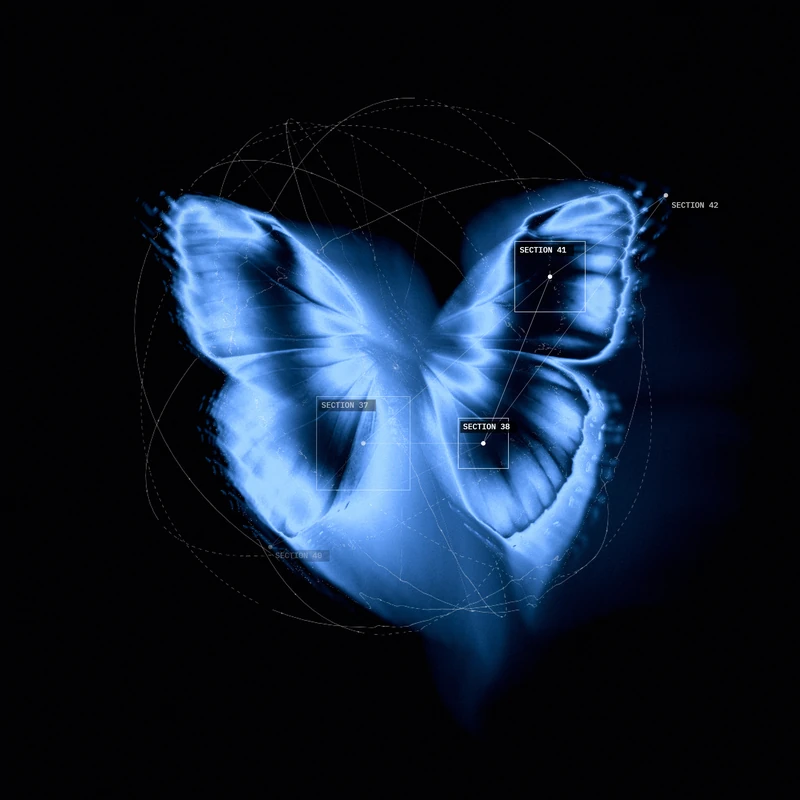
Radial's graphics are botanical structures annotated with machine vision data. The guidelines should show that combination, so new images keep both parts.
6. The product
For tech and health startups the product is where people see the brand most. Include:
- Interface colours and type styles
- Buttons, inputs and other core components
- Icons and their style
- Layout and grid rules
- Motion: how things move and how fast
Radial's UI follows Swiss editorial principles, structured and typographic, in a dark terminal setting, with calm animation. Plasma's UI uses clean, round shapes and simple navigation. Its name comes from the liquid part of blood, and that idea shapes the typeface and the round corners as well. Rules like these let engineers build new screens that match without a designer checking each one.
7. Templates and files
Guidelines are only useful if the files are easy to find. Deliver:
- Logo files in SVG, PDF and PNG
- Font files or licence links
- Colour values in a form designers and engineers can copy
- Templates for the pitch deck, social posts, documents and email signatures
- Graphics and image assets
- A short list of who to ask when something is not covered
What to leave out
Long guidelines often go unread. Leave out:
- Pages of brand philosophy
- Rules for materials you do not make yet
- Every possible misuse of the logo. A few examples are enough.
Start with what the team needs now, and add sections as the company grows.
Keep them alive
Put the guidelines where the team works: a shared link, a design file or a page on your internal wiki. Update them when the brand changes, and tell people when you do. A PDF sent once and forgotten is not doing its job.
See also our guides on logo design for tech startups and when to rebrand a startup.
Questions
Yes, but a short version. Even a few pages on the logo, fonts, colours and graphics keep the deck, the website and the product consistent as more people start working on them.
As short as possible while still answering the common questions. For most startups that means one section each for the idea, the logo, typography, colour, graphics and the product, plus the files and templates.
A format the team can open easily and that you can update: a shared design file, a web page or a PDF kept in one known place. Include the source files next to it.
They should be. We deliver guidelines and source files as part of our identity projects, so the team and partners can use the brand correctly from the first day.
Not sure your brand is working?
I'm Sam, founder of Second Eight. I design brands for AI, tech, science and health companies, so I know what investors and customers read in a brand before they read anything else. Send me your website and deck, and I'll tell you what works, what's holding you back and what I'd change. You get a one-page scorecard and a 30-minute call with a straight answer: keep it, fix it or rebuild it.