Logo Design for Tech Startups: A Practical Guide
In short
- A tech logo lives mostly on screens, often very small. Design it for an app icon and a browser tab first.
- Build the logo from one idea connected to the company, and keep the explanation simple.
- Make a small set of versions and files, so the logo works everywhere without being redrawn.
Contents (9)
A tech startup's logo appears in more places than most founders expect: the app icon, the browser tab, the login screen, the pitch deck, a conference badge, a social profile and the invoice. Most of those places are small screens. A logo that only looks good large on a white page will fail in most of them.
This guide covers what a tech logo has to do and how we design one, with examples from tech companies we branded at Second Eight.
What the logo has to do
Before any sketch, agree on the jobs the logo must do:
- Work at small sizes. As an app icon and a favicon, the logo may be only a few millimetres wide on a phone. Fine detail disappears.
- Work in one colour. It should hold up in black, in white and in a single brand colour, on light and dark backgrounds.
- Be easy to recognise. People should know it after seeing it a few times, without reading the name.
- Fit the product. For most tech companies the product is where people see the logo most. It should sit well in the interface.
- Be easy to explain. The team should be able to describe it in one sentence.
Choose the type of logo
There are three common types. Each one fits a different situation.
- A wordmark is the name set in type. It works when the name is short and distinctive. It is weaker as an app icon, because a full word is hard to read at small sizes.
- A lettermark is the first letter drawn as a mark. It works well as an icon and keeps a direct link to the name.
- A symbol with a wordmark pairs a mark with the name. The symbol does the small jobs, the icon and the favicon, and the wordmark does the large ones.
Most tech startups need a symbol or a lettermark for the product and a wordmark for everything else.


Not sure your brand is working?
I'm Sam, founder of Second Eight. I design brands for AI, tech, science and health companies, so I know what investors and customers read in a brand before they read anything else. Send me your website and deck, and I'll tell you what works, what's holding you back and what I'd change. You get a one-page scorecard and a 30-minute call with a straight answer: keep it, fix it or rebuild it.
Build the logo from one idea
A strong logo comes from one idea connected to what the company does. The idea should be literal enough to explain simply.
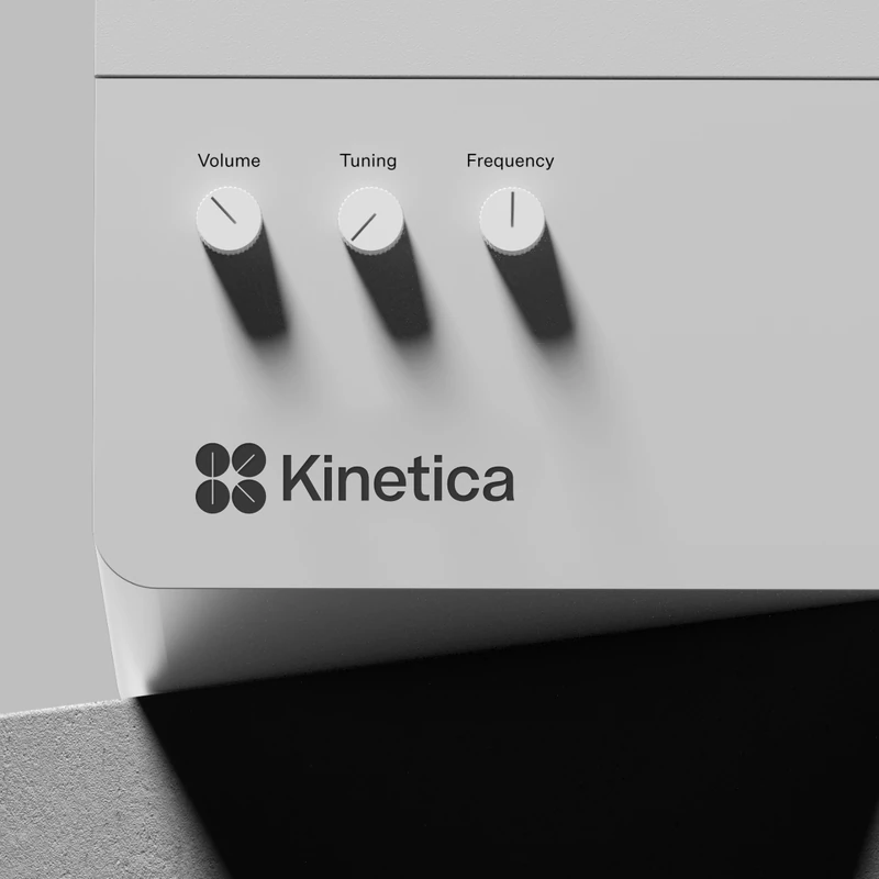
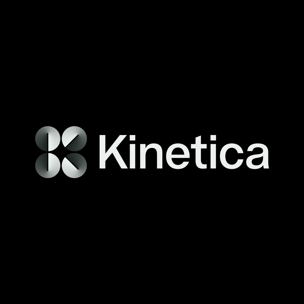
Kinetica is a music sequencer that can also be used for live music and as a digital audio studio. The symbol comes from the buttons on old-school controllers used to adjust channels and effects. Four buttons are turned into different positions, and together they form the letter K, the first letter of the name. It is a lettermark and a picture of the product's controls at the same time.
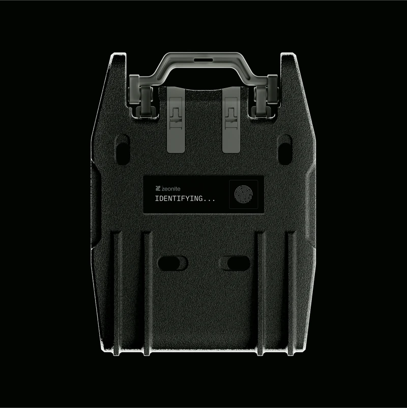
Zeonite makes safes and locks built on biometric authentication, artificial intelligence and data protection. Its logo is two pieces coming together, for a constant connection to the things you own. The fine lines in the mark are taken from the brand's security graphics, which are based on fingerprints and iris patterns.
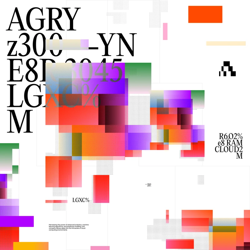
Augury builds predictive analytics and AI tools. Its logo is a pixel A, from the letter A and the idea of a computer. The brand's graphic language is moving pixels, so the logo belongs to the same family as everything else.
In each case the logo comes from something real about the company: its product, its technology or its name.

Draw it on a grid
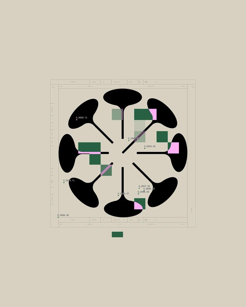
Tech logos often need precise geometry, because they sit next to interface elements drawn on a pixel grid. We construct the mark from simple shapes with clear rules: circles of set sizes, fixed angles, equal line weights.
The Kinetica mark is built from four circles. The Zeonite mark is drawn with fine guide lines. A construction drawing like this has two uses. It makes the logo consistent, and it gives the team and future designers a clear reference for how the mark is made.
Test it small, early
Test the logo at small sizes from the first sketches, not at the end.
- Put it in a phone dock next to other app icons.
- Put it in a browser tab next to other tabs.
- Print it small on a business card.
- Look at it from across the room.
If the mark becomes a blur at icon size, simplify it. Thin lines, small gaps and many parts are the usual problems. Augury's logo was reduced and streamlined for exactly this reason, so it would work for all brand uses.
Decide if the logo needs to move or change
Some tech companies need more than one fixed mark.
- Animation. A logo that builds or moves is useful for product launches, loading screens and social posts. Plan it while you design the mark, so the animation follows the logo's own construction.
- Variations. Augury works across many industries, so it needed a generative logo that adapts to each one while keeping its link to the original design. That is a specific need. Most startups are better served by one fixed mark used consistently.

Make the set of versions and files
A finished logo is a small system, not a single file. At launch you need:
- Primary logo: symbol and wordmark together, horizontal
- Stacked version for square spaces
- Symbol alone for the app icon, favicon and social profile picture
- Colour versions: full colour, black, white and one brand colour
- Clear space and minimum size rules
- Files: SVG for web and product, PDF for print, PNG for quick use, and the app icon sizes your platforms ask for
Write the rules down in your brand guidelines, so no one stretches, recolours or redraws the logo later.
Common mistakes
- Starting with the logo before the name and positioning are clear. The logo should express a decided idea.
- Using a generic tech symbol. Circuit lines, globes and abstract swooshes are hard to tell apart from other companies.
- Too much detail. What works on a poster may not work as a 16 pixel favicon.
- Choosing a logo only on a white slide. Judge it in the product, on dark and light, and at icon size.
- Over-explaining the mark. If the story needs a paragraph, the idea is probably not clear enough.
For more on the name behind the logo, see how to name a startup.
Questions
It works at very small sizes, in one colour and inside the product. It comes from one clear idea connected to the company, and the team can explain it in a sentence.
Most need both. A symbol or a lettermark does the small jobs, like the app icon and the favicon, and a wordmark does the large ones, like the website header and the deck.
A logo is usually designed as part of a brand identity project, together with typography, colour and graphics. That typically takes a few weeks. Agree the scope and the timeline before you start.
SVG and PDF vector files, PNG files, versions in colour, black and white, a symbol-only version, app icon sizes, and clear rules for spacing and minimum size.
Not sure your brand is working?
I'm Sam, founder of Second Eight. I design brands for AI, tech, science and health companies, so I know what investors and customers read in a brand before they read anything else. Send me your website and deck, and I'll tell you what works, what's holding you back and what I'd change. You get a one-page scorecard and a 30-minute call with a straight answer: keep it, fix it or rebuild it.