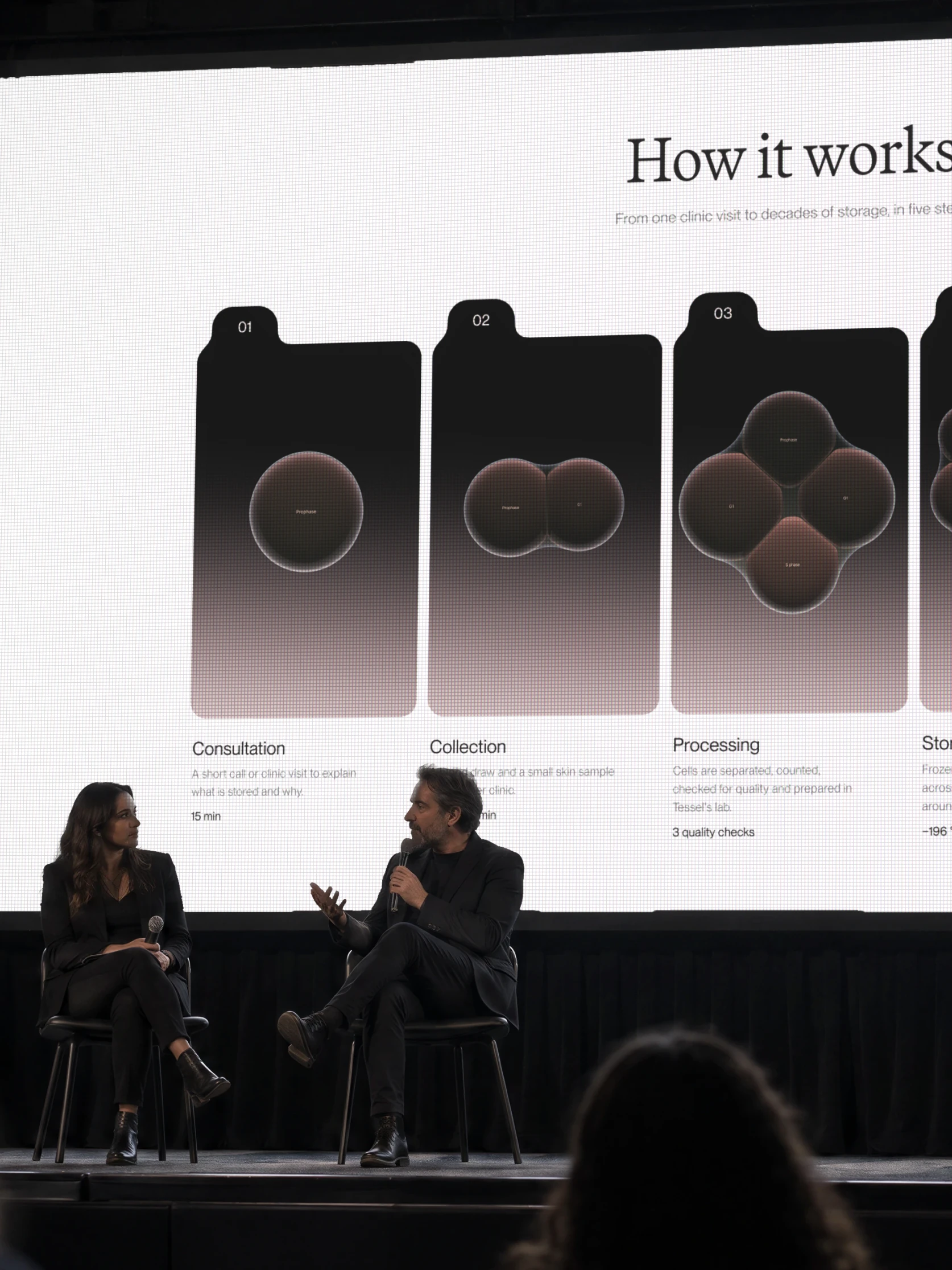
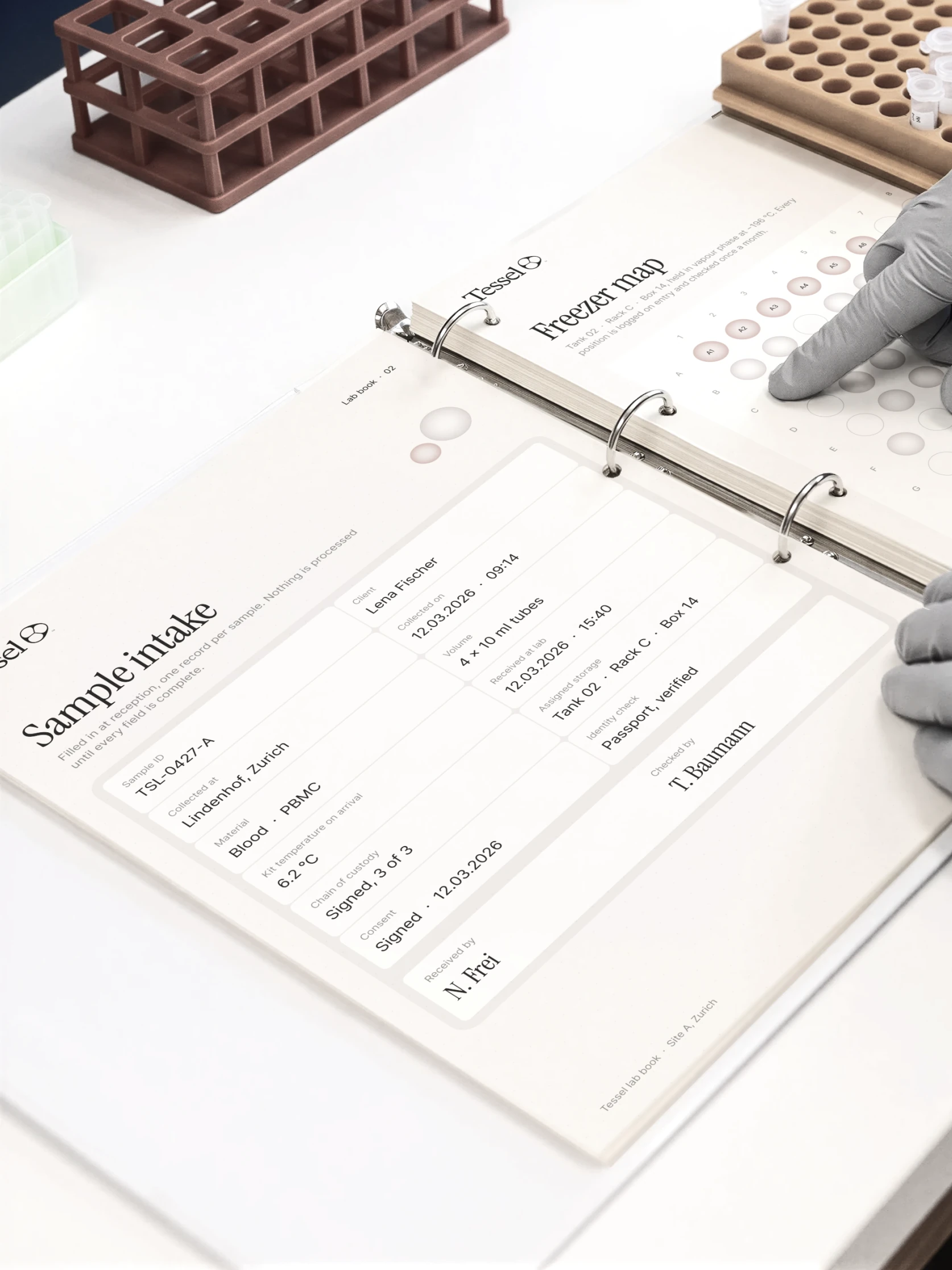
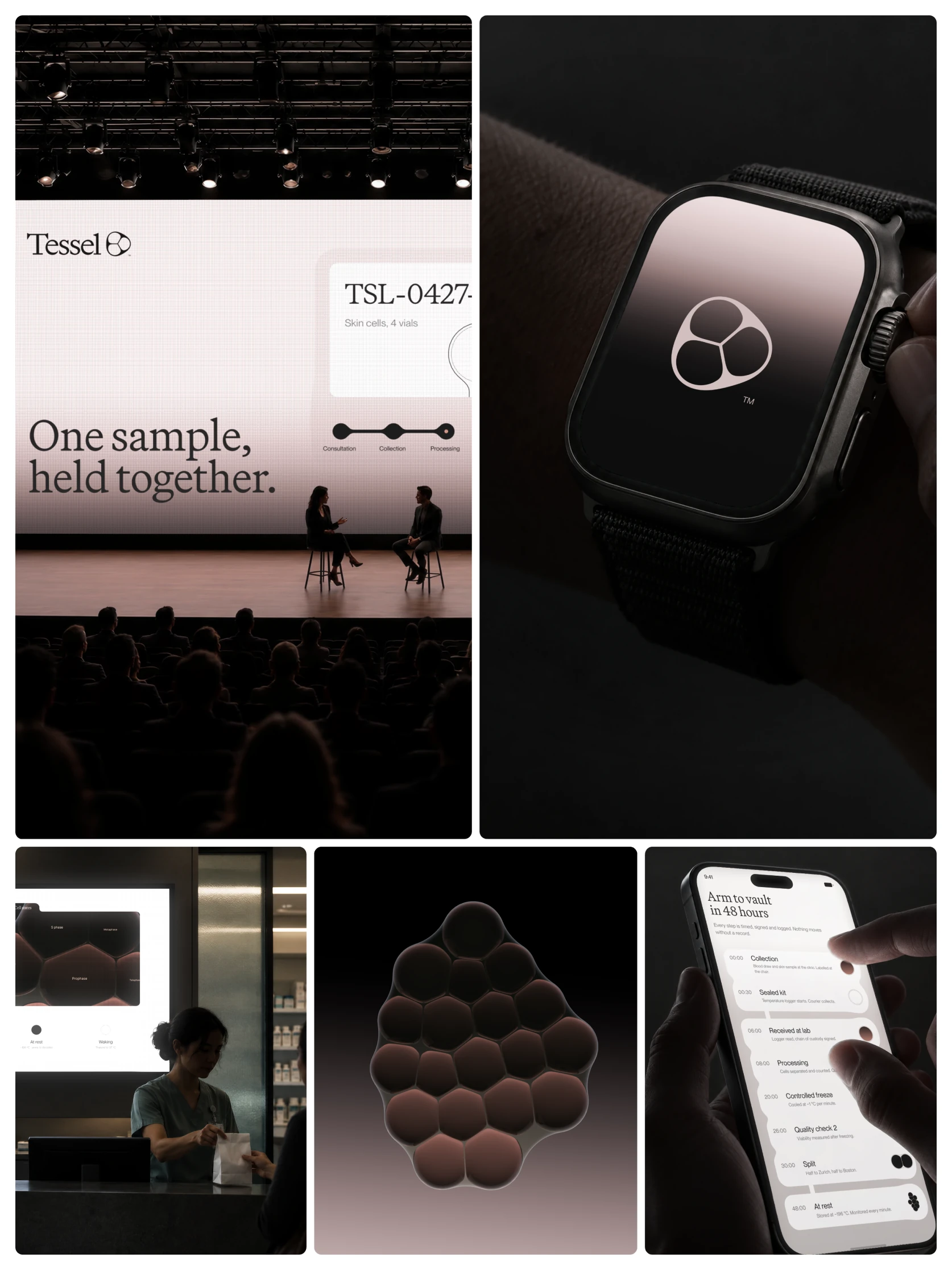
Tessel is a cell banking company. It collects a person's own cells while they are young and healthy, stores them at -196 °C, and brings them back when a therapy needs them. A healthier version of yourself, kept in reserve. It is a studio project.
The concept came from G0, the resting state of a cell. Alive, but not dividing. Held still until it is needed. That is exactly what Tessel does with every sample.
The name comes from tessellation, shapes fitting together with no gaps, the way cells form tissue.
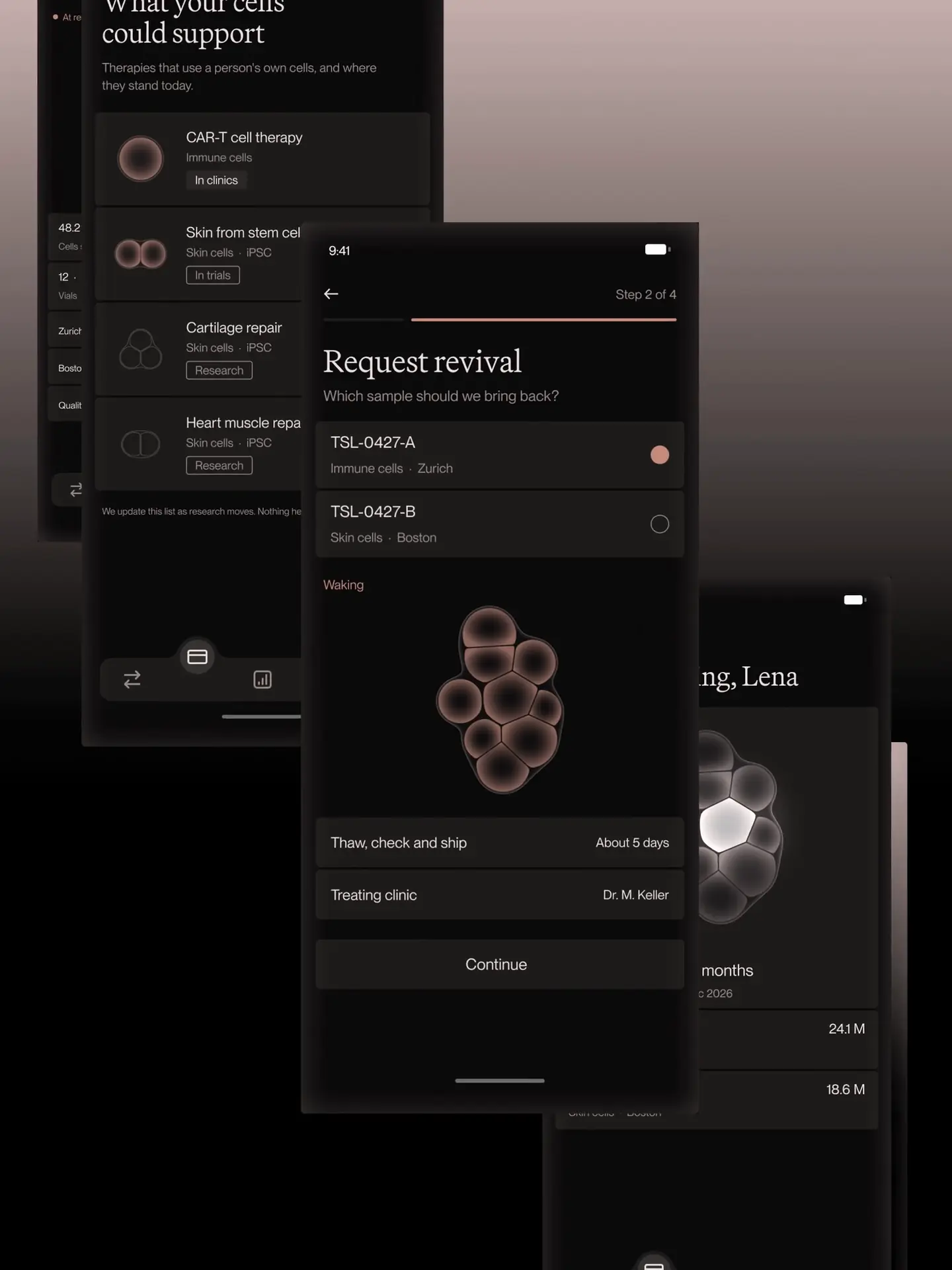
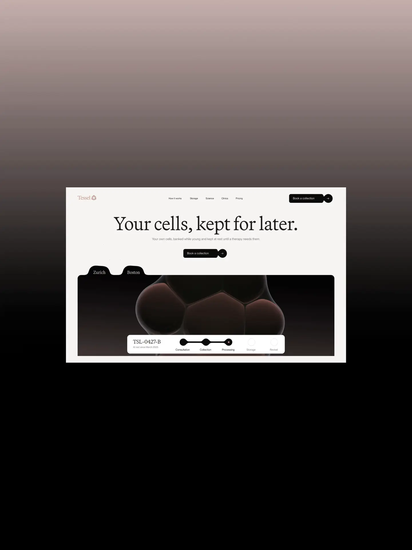
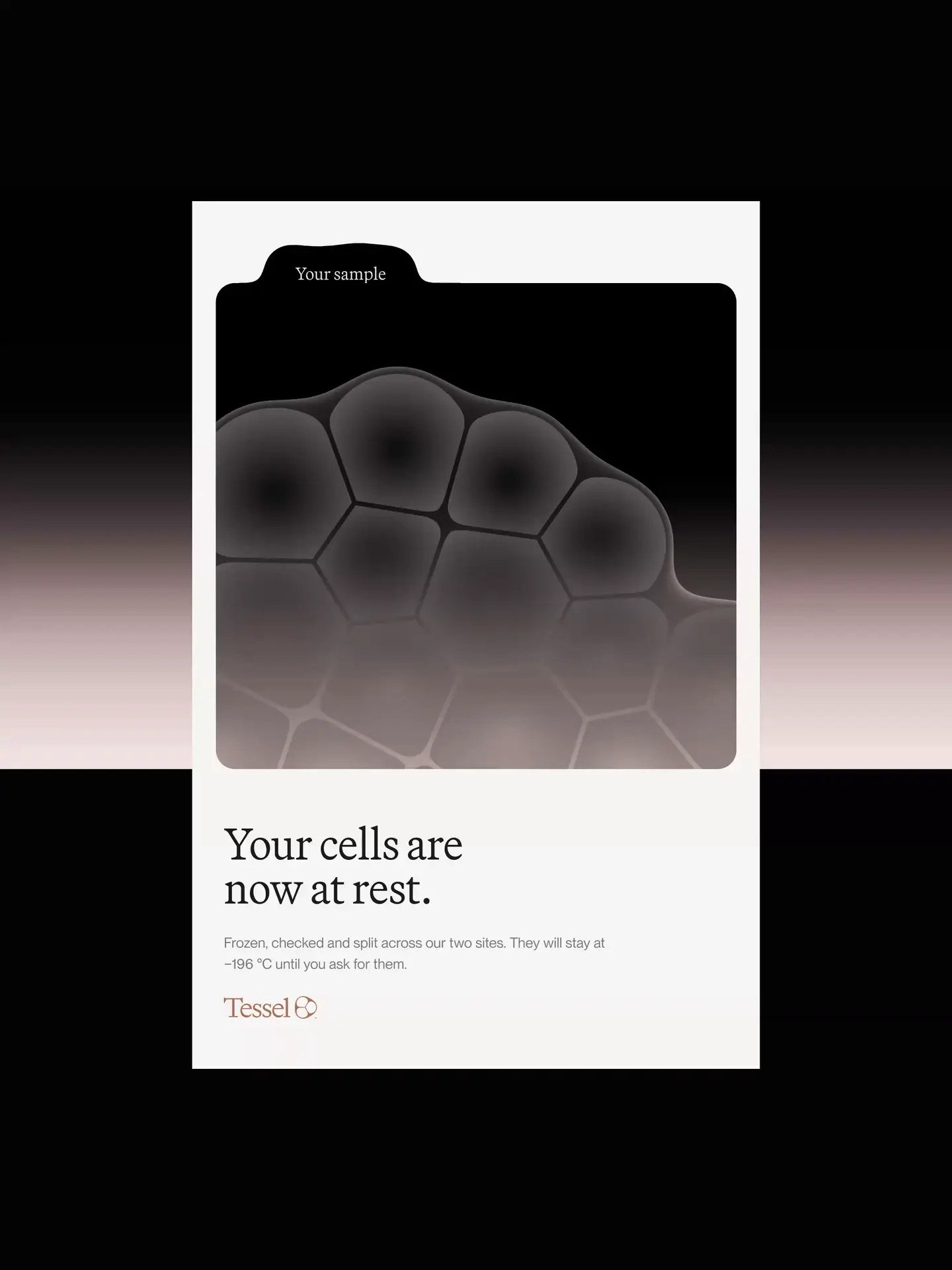
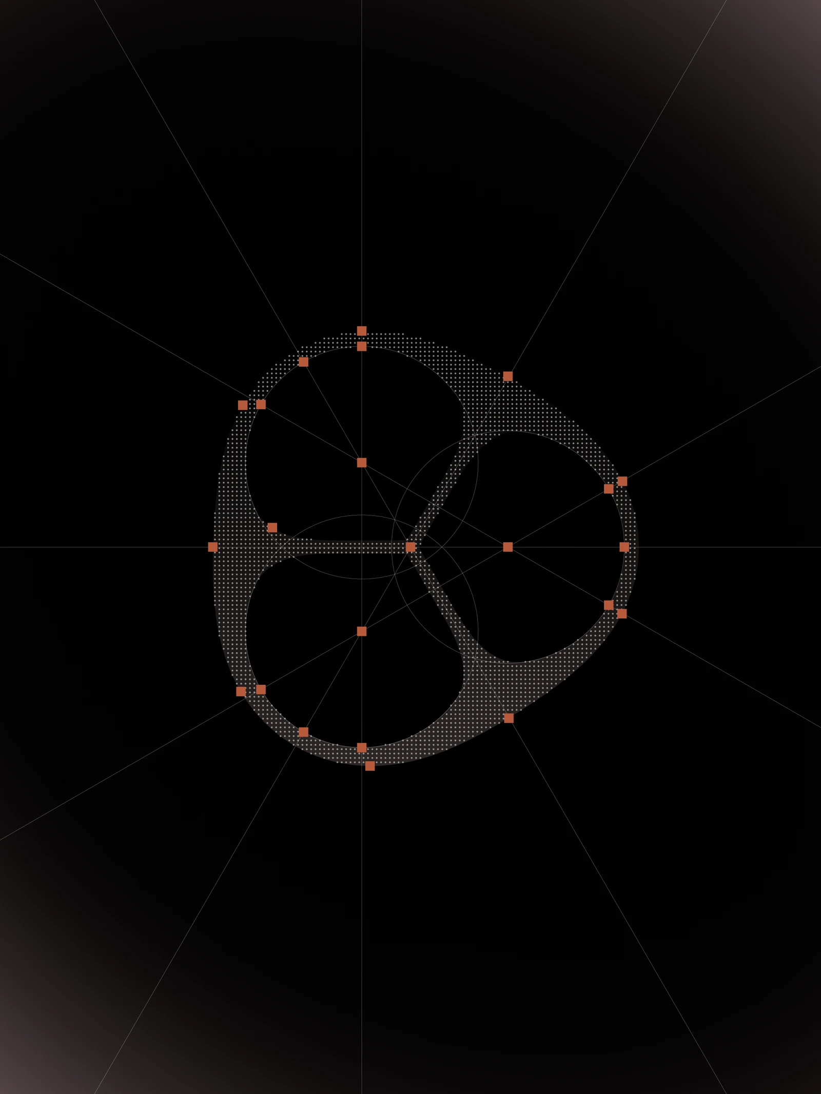
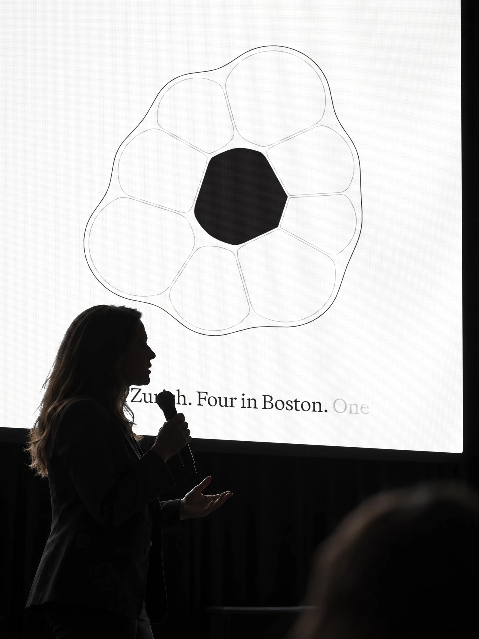
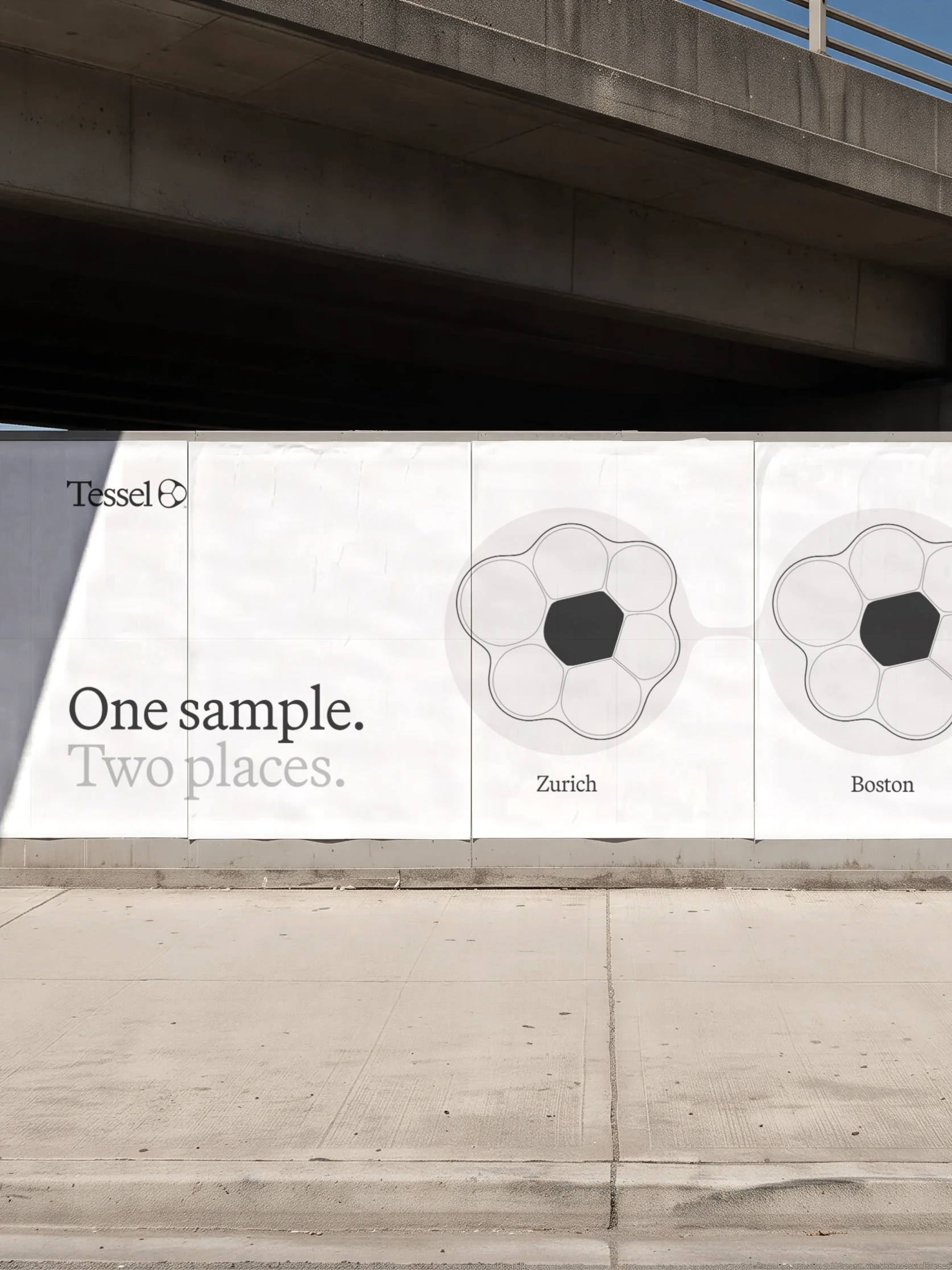
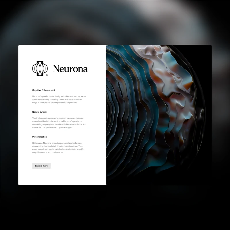
The logo is a hand-drawn mark of three cells held inside a soft skin. That skin became the main motif of the system, wrapping graphics, images and UI elements.
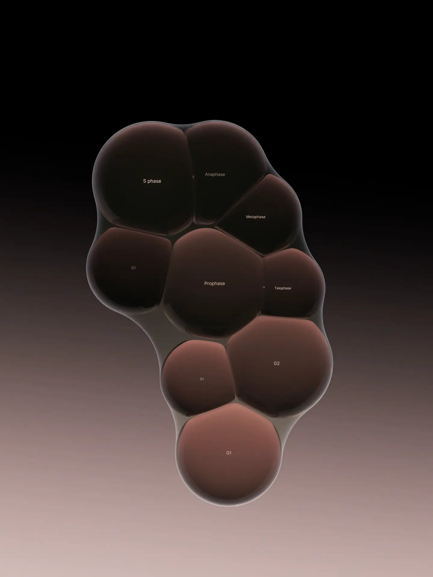
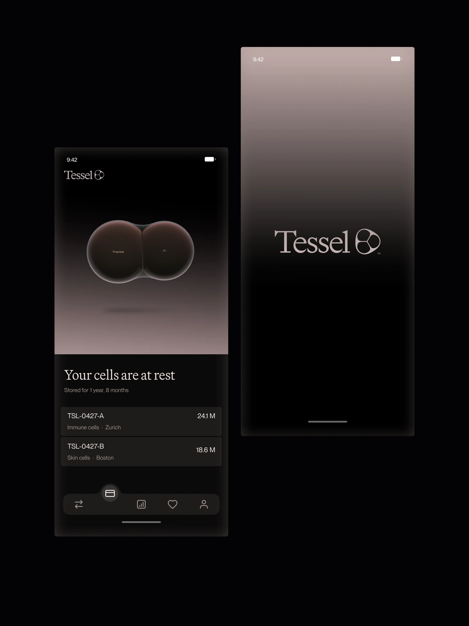
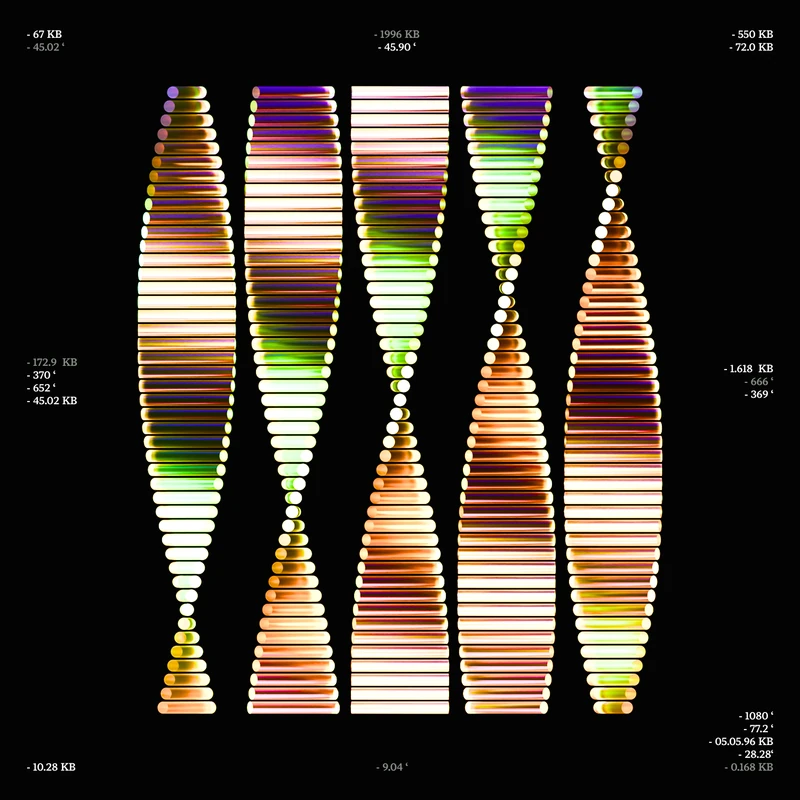
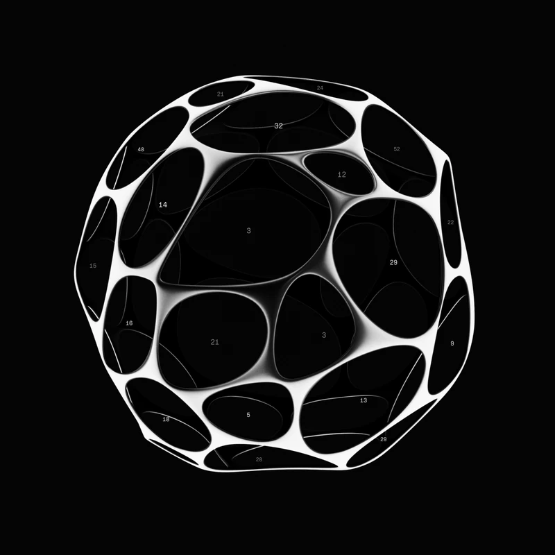
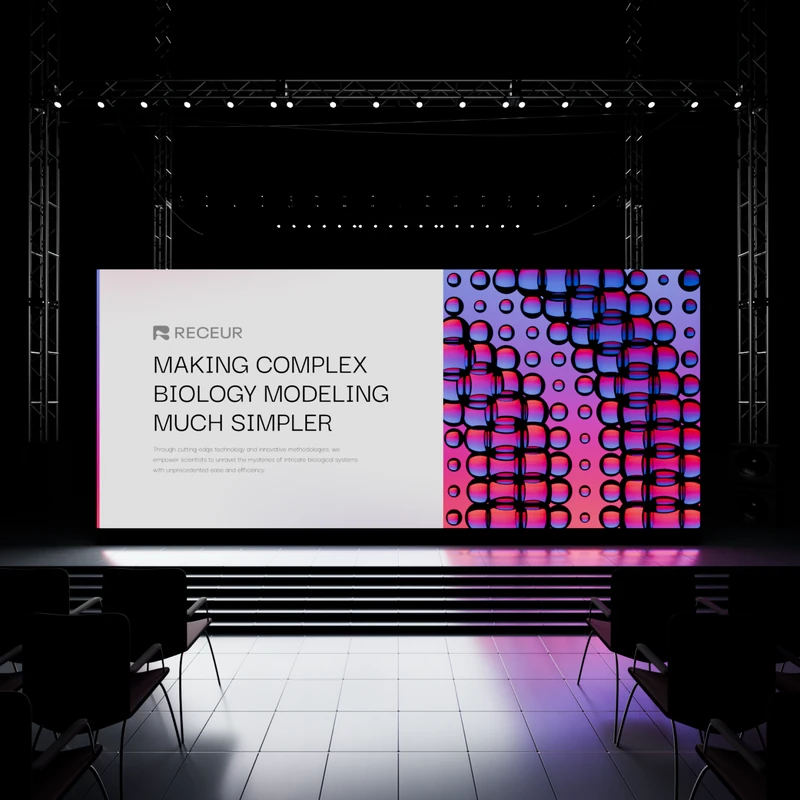
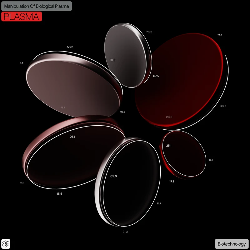
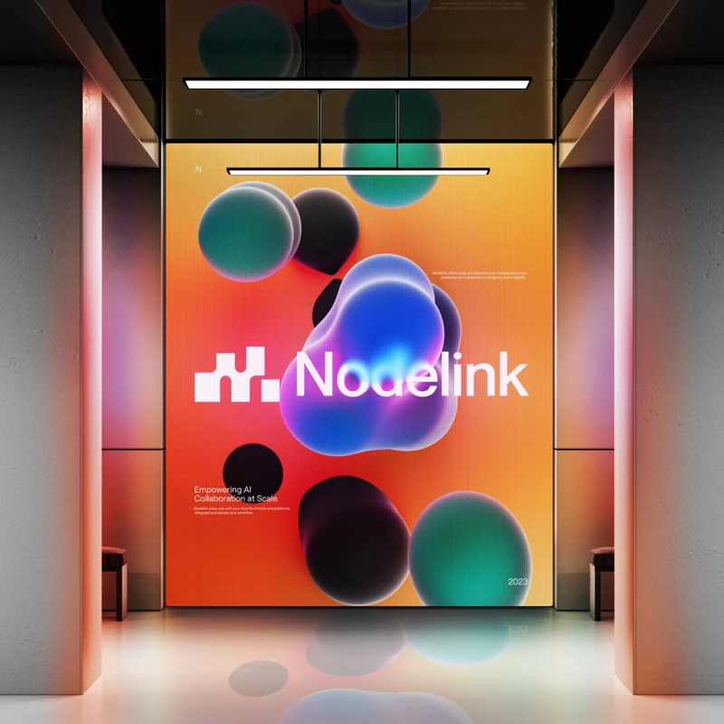
The core graphics are glassy 3D cells packed into clusters. A slow light wave moves through them. Cells dim into rest and light up again. Cell cycle labels like G1, S and G2 sit on the cells as quiet data. Flat black cells and outline-only cells extend the system into secondary use.
The palette runs from deep black into warm mauve and soft pink, taken from the light inside the cells. Terracotta, clay, violet, cyan and red appear only as small accents. Titles are set in Martina Plantijn, paired with one sans. Two fonts, one weight each.