How Tessel Was Made: From a Cell Animation to a Biotech Brand
In short
- Tessel began with the graphics: a 3D cluster of glass cells, made before the company had a name.
- The concept, G0, the resting state of a cell, gave the graphics a meaning and the company a purpose.
- One motif, a soft skin around the cells, ties the logo, the graphics and the interface together.
Contents (8)
Most brand projects start with a brief. Tessel started with a picture. It is a studio project, so there was no client and no deadline, only a set of 3D cells I could not stop working on. This is how it turned into a full brand identity for a cell banking company.
It started with the cells
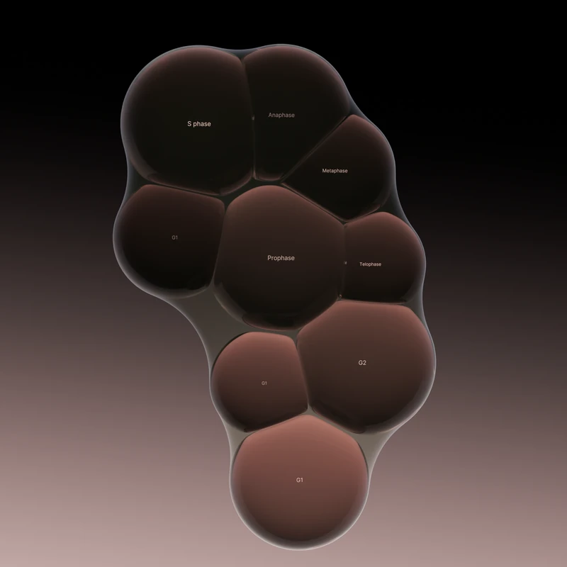
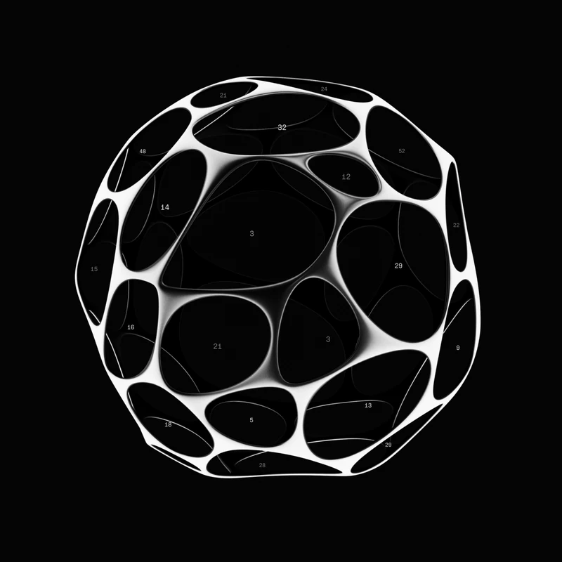
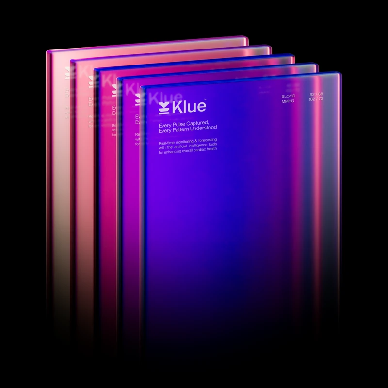
The first version was a study in Blender, built with geometry nodes: cells packed together with no space between them, moving slowly against each other. I made several versions. A flat one. A faceted one with many colours. Then a cluster of dark glass cells, lit from inside, which felt the most alive.
Each cell carried a small label. At first these were numbers. Later they became the stages of the cell cycle, such as G1, S and G2, so the labels meant something.

At this point it was only a graphic. A good one, but without a reason to exist.
Giving the graphics a company
The question was simple: what kind of company would look like this? The cells were still, held together and softly lit, so the answer had to be about keeping cells safe.
That became cell banking. Tessel collects a person's own cells while they are young and healthy, stores them at -196 °C, and brings them back when a therapy needs them.
The concept came from biology. G0 is the resting state of a cell: alive, but not dividing, held still until it is needed. That is exactly what Tessel does with every sample. Once that idea was in place, the animation had a script. A slow light wave moves through the cluster. Cells dim into rest and light up again.
The name
The name comes from tessellation, shapes fitting together with no gaps, the way cells form tissue. It also describes the graphics, where the cells are packed tightly with no space between them. A name that explains both the science and the look is rare, so I kept it.
Drawing the logo
The logo is a hand-drawn mark of three cells held inside a soft skin: two stacked on the left and one on the right. I drew it by hand first, then refined the curves in a small tool I built for cell-like marks, where overlapping shapes melt into one rounded line.

The skin around the three cells turned out to be the most useful part. It became the main motif of the whole system. It wraps graphics, images and interface elements, so even a button or a photo frame feels like part of the same organism.
Colour and type
The palette was taken from the light inside the cells. It runs from deep black into warm mauve and soft pink. Terracotta, clay, violet, cyan and red appear only as small accents.
Titles are set in Martina Plantijn, paired with one sans. Two fonts, one weight each. The rule is strict on purpose: with graphics this rich, the type has to stay quiet.
From 3D to flat
Glass cells are beautiful at full size and useless as a favicon. So the system has three levels of the same shape: the glassy 3D cells for main graphics, flat black cells for secondary use, and outline-only cells for small sizes and diagrams. In the logo animation the 3D cluster turns into the flat cells in the exact same shape, then into the mark.
Putting it to work
A brand is only proven in use, so the last step was designing where Tessel would live: an app where your stored samples are shown at rest, a website, a keynote, posters and a sample intake binder for the lab.


What I took from it
- Graphics can come first. A strong visual can lead you to the idea, as long as you then do the work of giving it a real meaning.
- Let one concept explain everything. G0 gave Tessel its purpose, its animation and its tone of voice.
- Find the motif. The skin was a small detail of the logo. It ended up holding the whole system together.
- Plan for small sizes early. The flat and outline versions made the brand usable everywhere.
You can see the finished identity on the Tessel project page, and more examples in biotech branding examples.
Second Eight is a branding agency for biotech companies. See our biotech branding work.