Biotech Branding Examples: 7 Brand Identities and What Makes Them Work
In short
- Each identity starts from one idea taken from the company's own science.
- That idea runs through the logo, the graphics, the colour and the motion.
- The strongest systems use few elements: one motif, a short palette, one or two typefaces.
Contents (9)
Good biotech branding is easier to show than to describe. These are seven biotech brand identities designed at Second Eight. For each one, this is the company, the idea, and what you can take from it for your own brand.
All seven are our own work, so we can explain the thinking behind them and not only the result.
1. Tessel: cell banking

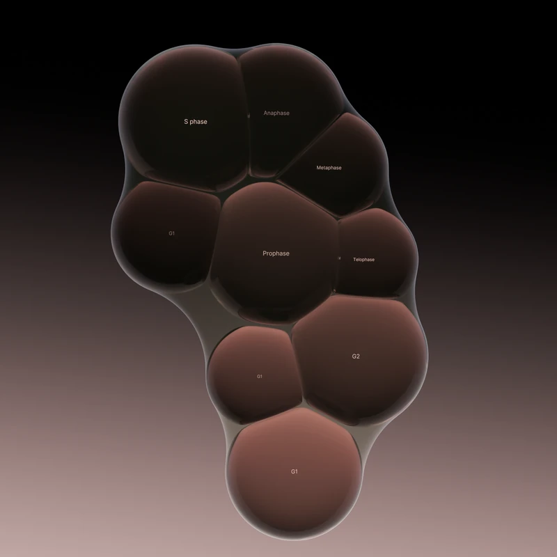
Tessel is a cell banking company and a studio project. It collects a person's own cells while they are young and healthy, stores them at -196 °C, and brings them back when a therapy needs them.
The concept came from G0, the resting state of a cell: alive, but not dividing. The name comes from tessellation, shapes fitting together with no gaps, the way cells form tissue. The logo is a hand-drawn mark of three cells held inside a soft skin, and that skin became the main motif of the system, wrapping graphics, images and UI elements. The palette runs from deep black into warm mauve and soft pink, taken from the light inside the cells.
What to take from it: find the one scientific state or process that describes what you do, and let the name, the mark and the motion all come from it.
2. Cultiv: botanical cell culture

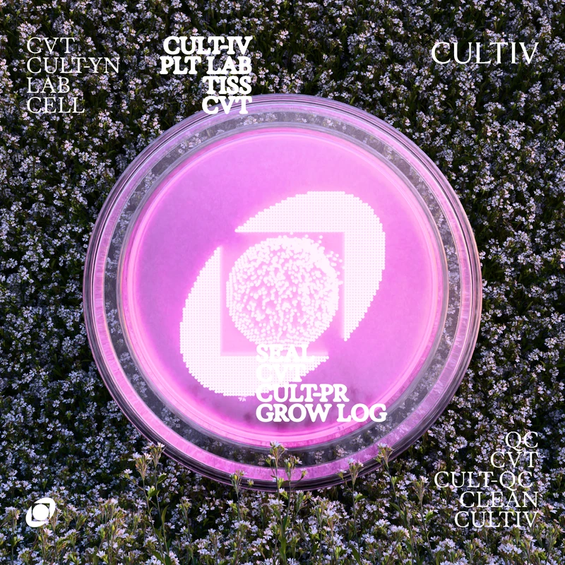
Cultiv is a botanical cell culture lab that grows plant-based bioactives in vitro, with lab methods and AI.
The logo is based on a petri dish held in hands, and what lives inside it. The slow movement of the medium and the microorganisms became the graphic language. Soft natural tones sit beside vivid colours drawn from microorganisms.
What to take from it: the lab itself is full of images. A petri dish, a medium, a culture can become a mark if you look at it closely.
3. Cellbased: cell therapies for cancer
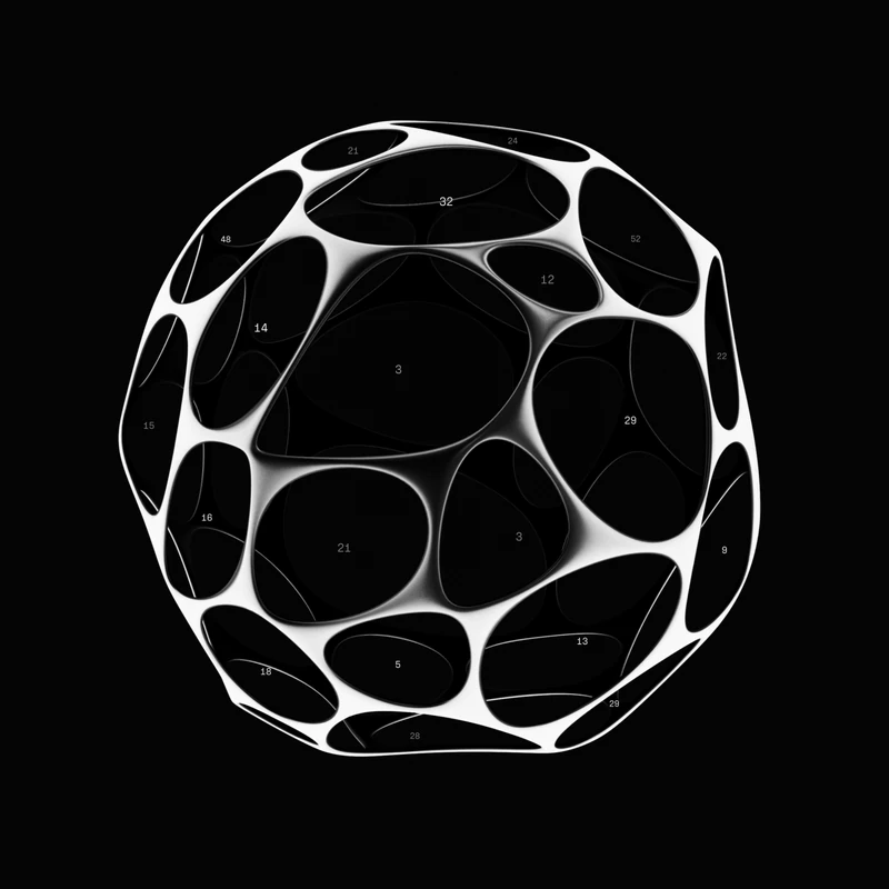
Cellbased develops cell therapies for cancer and other severe diseases, with a focus on data handling.
The logo is built from voronoi patterns based on cell formations, and the icons use the same patterns. The graphics combine precise lines with 3D cell structures. The palette is strictly black and white.
What to take from it: a serious subject does not need many colours. Limiting the palette can be the strongest choice in the system.
4. Receur: generative biology
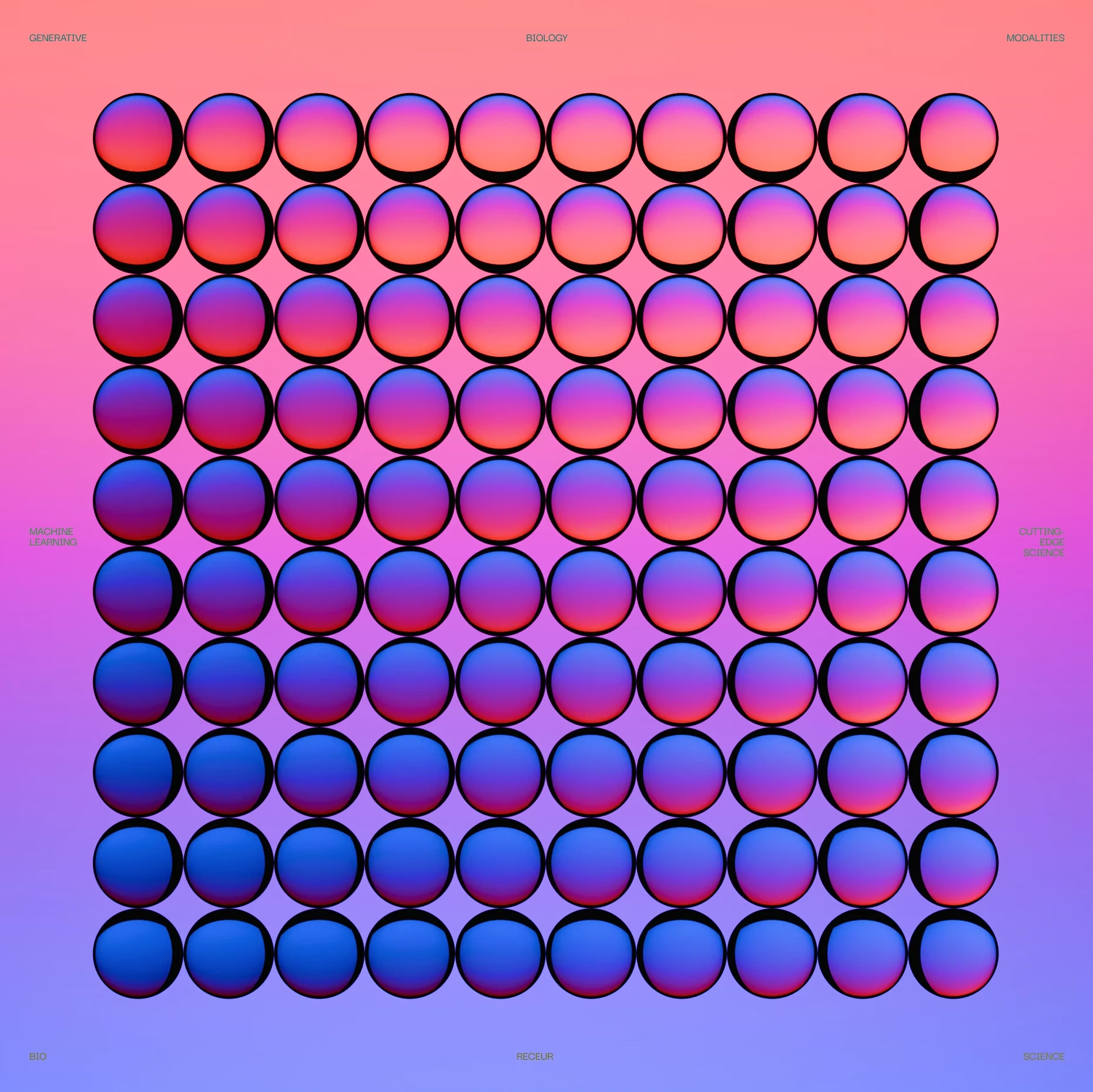
Receur models biology to simplify complex processes and to engineer protein-based treatments.
The logo is an abstract letter R formed from fluid human cells. The graphics draw on living cells, data and artificial intelligence, and work as a design system across every Receur application. The palette is bright and optimistic, and the animations use soft, subtle movement.
What to take from it: biotech does not have to look cold. If the company's message is optimistic, the colour can be too.
5. Sequence: genetic data analysis

Sequence is a deep-tech healthcare company that analyses genetic data.
The name means an ordered set, one thing following another. Small lines stand for that idea. They form the S of the logo, and in the graphics they build DNA strands and abstract shapes. The colour palette comes directly from the four DNA bases: adenine, thymine, cytosine and guanine.
What to take from it: one simple element, repeated, can build a whole system: the logo, the graphics and the icons.
6. Plasma: blood diagnostics

Plasma provides blood diagnostics, using biotechnology and data science for personal health insights.
In biology, plasma is the liquid part of blood. The name, the round typeface and the whole look come from that. The logo and graphics are based on blood cells in clean 3D, and the interface uses round shapes with red as the only colour.
What to take from it: when the name already holds the idea, let everything else follow it, down to the corners of the buttons.
7. Aevum AI: genetic data and AI

Aevum AI decodes genetic data with artificial intelligence. Aevum means lifespan in Latin.
The logo, a stylised A, is built from three intersecting parts for health, AI and science. The graphics combine paint-like visuals with data abstraction, and the typography is bold and easy to read at any age.
What to take from it: a biotech brand for a wide audience can be vivid and warm, as long as the structure underneath stays clear.
What these biotech brands have in common
- The idea comes from the science. A resting cell, a petri dish, a voronoi pattern, the four DNA bases. None of them started from a trend.
- One motif does most of the work. The skin in Tessel, the lines in Sequence, the discs in Plasma.
- The palette is short. Often two or three colours, sometimes only black and white.
- Motion is part of the identity. Each brand has a way of moving that matches what the company does.
If you are starting your own, our guide to biotech branding covers the process step by step.
Questions
A good biotech logo comes from something true about the company's science, stays clear at small sizes such as a favicon or a slide corner, and belongs to a larger system of type, colour and graphics. It should not rely on a generic helix or molecule that any company could use.
There is no single biotech colour. Blue and green are common, which is a reason to consider something else. The examples here use black and white, warm mauve, red, and palettes taken from DNA bases and microorganisms. The colour should come from the idea behind the brand.
Fewer than most people expect: a logo, one or two typefaces, a short palette, one graphic motif and clear rules for motion. A small system used consistently looks stronger than a large one used loosely.
Second Eight is a branding agency for biotech companies. See our biotech branding work.