Branding for Healthtech Startups: A Practical Guide

In short
- In health, people share data only with a company they trust, so every brand choice has to feel careful.
- The app is the brand. Design the identity and the interface together.
- One identity has to work for patients, clinicians and investors at the same time.
Contents (7)
A healthtech startup asks people for something personal: their heart rate, their brain signals, their medical history. Nobody shares that with a company that looks careless. That is why branding matters more in health technology than in most other sectors.
This guide covers what a healthtech brand has to do and how to build one, with examples from health brands we designed at Second Eight.
Trust comes first
Trust is built from many small signals: a typeface that feels precise, colours that feel calm, a tone that never overpromises, an interface where nothing looks improvised. A single careless detail, a stock photo or a vague claim, can undo the rest.
This does not mean a health brand has to be cold or blue. It means every choice has to look intentional.
Name the company for people, not for investors
A healthtech name is said by patients, typed by clinicians and read by investors. It should be short, easy to say and free of jargon.
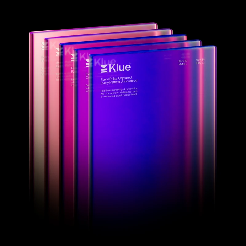
- Klue, an AI heart monitoring app, comes from "clue": a hint about your heart health.
- Revival, an AI platform for physical health, means an improvement in the condition or strength of something.
- Beyond Surgical refers to going beyond conventional surgical procedures.
Each name explains the promise in one word, without medical terms.
The app is the brand
In most health startups, people meet the product before they meet the logo. The interface is where trust is won or lost, so the identity and the UI should be designed together.

In Klue, the logo is made of flat planes that change shape until they form a heart. The icons and the interface follow the same idea, with transparency and a 3D style, so the app feels like the logo come to life.
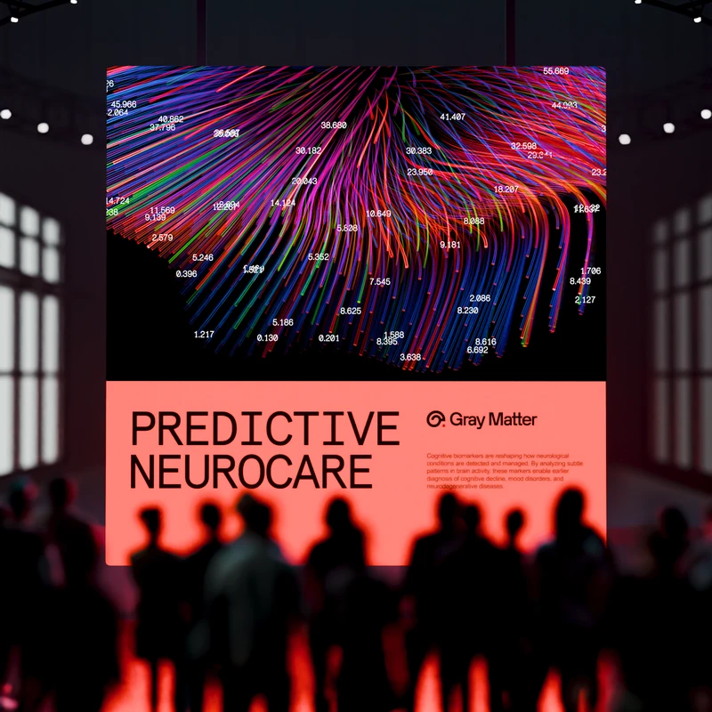
In Gray Matter, a neuroscience company for predictive neurocare, the UI is minimal, with strong typography, clean layouts and subtle motion. The graphics are built from the brain's structure and generated procedurally.
Speak to patients and clinicians at once
A patient wants calm and simple. A clinician wants precise and fast. An investor wants to see a serious company. One identity has to serve all three.
The way to do it is a clear system: one calm visual language for public-facing materials, and the same typefaces and colours used more densely for clinical and data-heavy screens. The brand stays the same, and the density changes.

Radial, an AI orchestration platform for health and life sciences, places a technical product in a human, biological context. The graphics are botanical structures annotated with machine vision data, close to scientific illustration, and the UI follows Swiss editorial principles in a dark terminal setting.
Avoid the healthcare clichés
Many health brands look alike: blue and white, a heart or a cross, smiling stock photos. Standing apart is easier than it seems.
- Gray Matter does not use gray. Its colours are bright and taken from data visualisation.
- Revival uses Renaissance-style sculpture, made digitally, as its image of an improving body.
- Beyond Surgical draws on science fiction, with detailed illustrations and lines taken from the logo.
Each choice comes from the company's own idea, which is why it feels right and not only different.
What a healthtech startup needs at launch
- A name and a logo that work as an app icon
- Typography and colour with clear rules for the app and the website
- A graphic language or illustration style
- App and dashboard UI in the brand
- A website that explains the product simply
- A pitch deck
- Motion for the logo and the launch
Questions
Enough for people to trust the product: a name, a logo, typography, colour, the app UI in the brand, a clear website and a pitch deck. A full guideline book can come later.
It can, but most health brands already do. Choose colours from your own idea. Gray Matter uses bright data colours and Radial uses a palette from nature.
It helps to work with someone who has designed health products before, because trust, accessibility and clinical use change many decisions. Look at their health work and their app design, not only their logos.
Working on a brand for your company?
Second Eight is a branding agency for science, health and technology companies. Sam Hox, the founder, leads every project. Two clients at a time.