Why Biotech Brands Need Motion Design in 2026

In short
- Motion is not decoration. It is communication.
- The most fundamental expression of motion in a brand identity is the logo animation.
- Motion design should not be added to a brand identity as an afterthought.
Contents (7)
Five years ago, motion design was a nice-to-have for most brands. Today, for biotech and life sciences companies, it is a core component of brand identity. The companies that understand this are pulling ahead. The ones that do not are being left behind.
The world your brand lives in has changed
Biotech companies no longer communicate primarily through printed materials and static websites. They communicate through investor presentations with animated data visualizations, through digital product interfaces that respond and move, through social media content that competes for attention in a fast-moving feed, and through website experiences that need to communicate complex science in seconds.
In this environment, a static brand identity is incomplete. Motion is not decoration. It is communication.
What motion design does for a biotech brand
Motion design serves several distinct functions in a biotech brand identity. It communicates scientific process and precision, showing how a technology works through animation rather than just describing it in words. It creates emotional engagement, bringing a brand to life in a way that static design cannot. It builds recognition, through consistent animation principles that become as distinctive as a color palette or typeface. And it signals sophistication, communicating to investors, partners, and potential employees that this is a company that operates at a high level.
The logo animation is where it starts
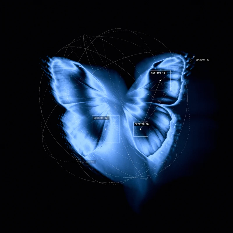
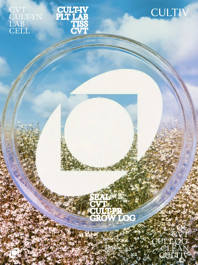
The most fundamental expression of motion in a brand identity is the logo animation. How a logo reveals itself tells a story about the company. A logo that animates through a scientific process, a chemical reaction, a data transformation, or a biological mechanism communicates something that a static logo never could.
The best logo animations are not arbitrary. They are grounded in the same visual metaphor that drives the entire brand identity. They feel inevitable, like the natural expression of what the company does.
Data visualization as brand expression
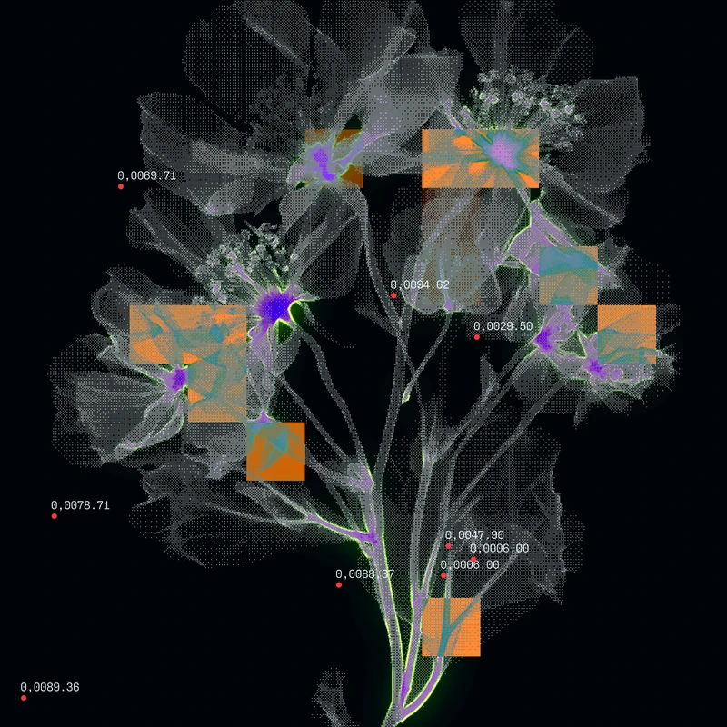
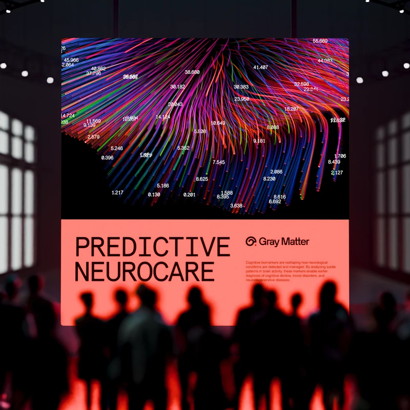
For biotech companies, data is at the center of everything. The way a company visualizes its data is one of the most powerful expressions of its brand identity. Animated data visualizations that move with precision and clarity communicate scientific credibility. Ones that feel generic or unclear do the opposite.
The best biotech brands treat data visualization as a core part of their visual language, with consistent color usage, typography, and animation behavior that makes every chart and graph feel unmistakably theirs.
Motion in digital product interfaces
For biotech companies building digital products, motion design in the user interface is both a brand expression and a functional tool. Transitions between states, loading animations, micro-interactions, and feedback animations all contribute to how a product feels to use.
A digital health product that moves with care and precision communicates trustworthiness. One that feels clunky or arbitrary communicates the opposite, regardless of how strong the underlying science is.
How to approach motion design in your brand
Motion design should not be added to a brand identity as an afterthought. It should be developed alongside the static identity, with clear principles that govern how the brand moves. What is the speed and rhythm of the brand? Does it move with precision and control, or with organic fluidity? What types of animation feel right for this company and wrong for others?
These questions should be answered in the same strategic phase that produces the visual identity, not after the logo has already been finalized.
Final thought
The science that biotech companies are doing is alive, dynamic, and constantly in motion. The best biotech brands reflect that. Motion design is not just a trend. It is the natural visual language of an industry built on process, transformation, and change.
Sam Hox is the founder of Second Eight Studio, a brand identity studio specializing in deep science, healthcare, and technology startups.