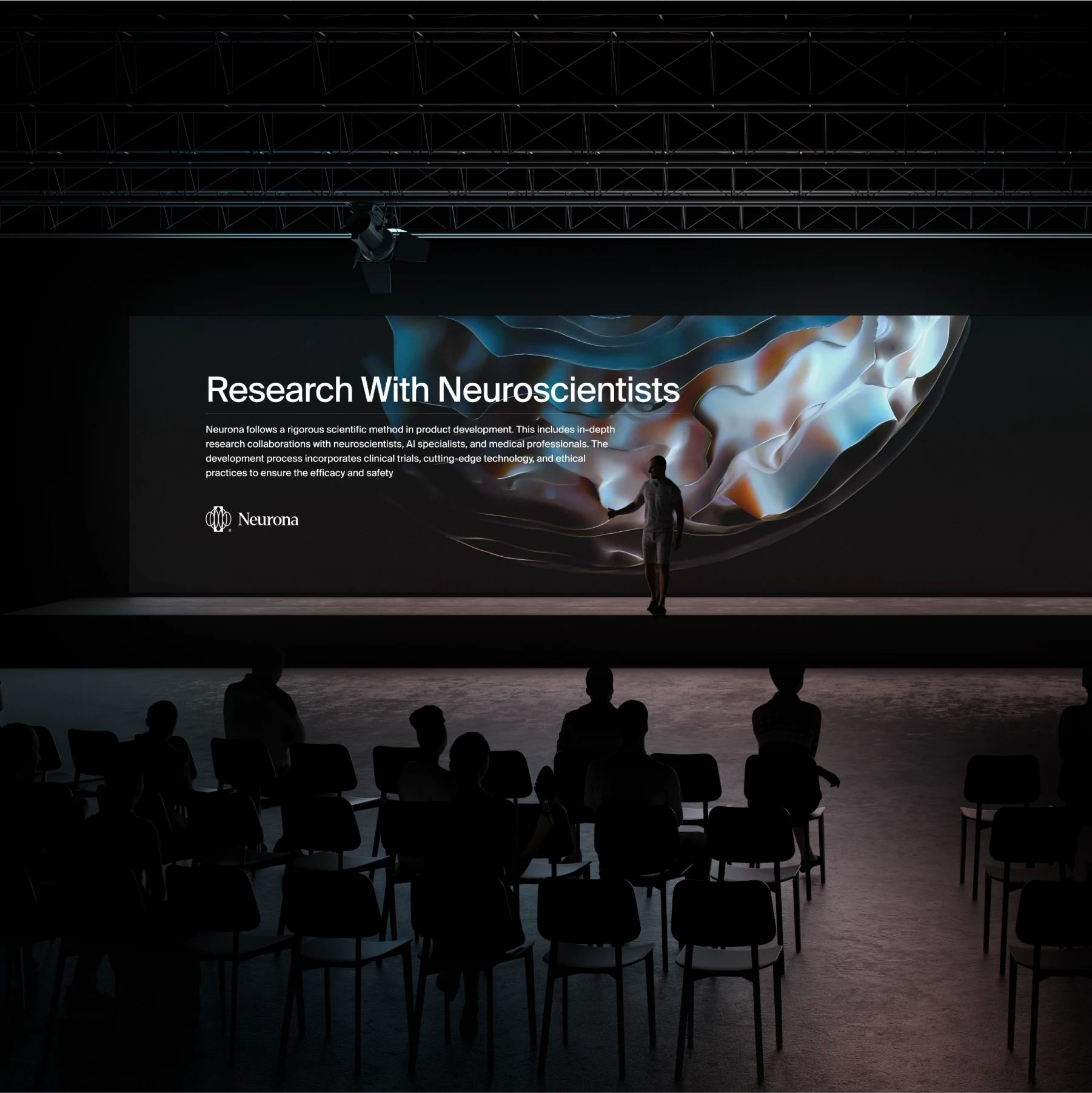
Neurona works across neuroscience, artificial intelligence and medicine. It develops science-based ways to improve cognitive function and brain health.
The name comes from "neuron", the basic unit of the nervous system that carries signals in the brain. Besides the name, we designed the brand, graphics, animation and UI/UX.
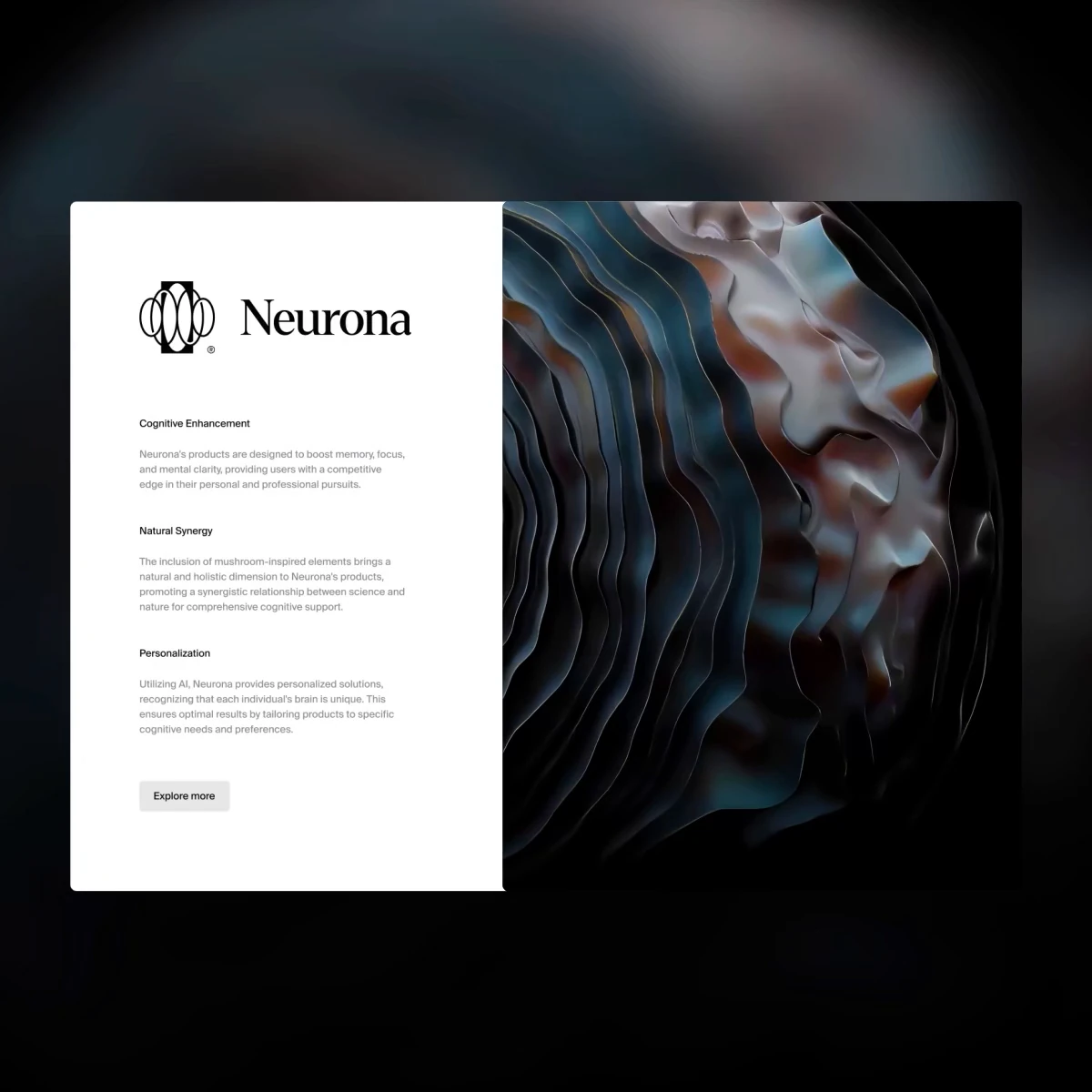
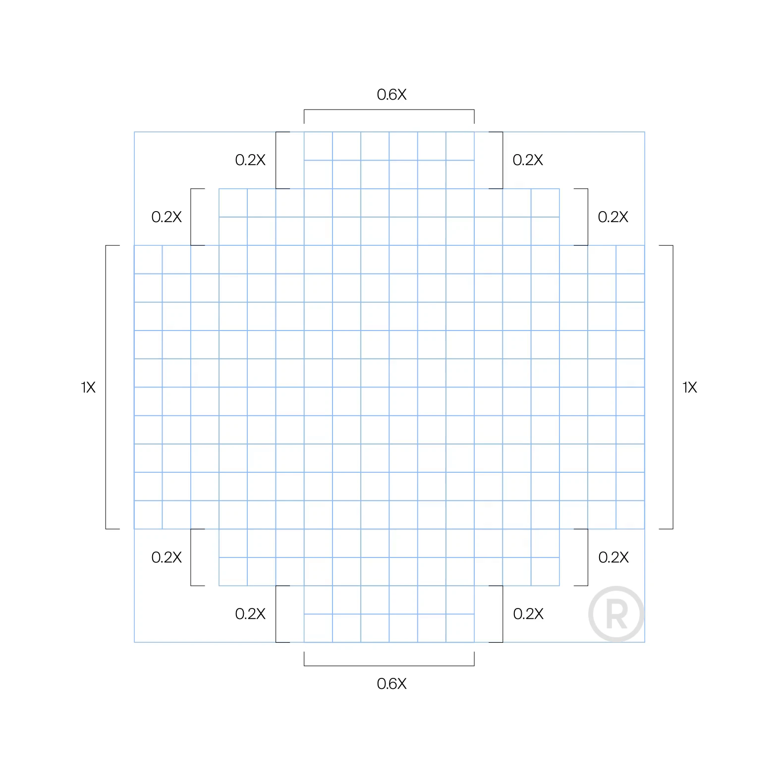
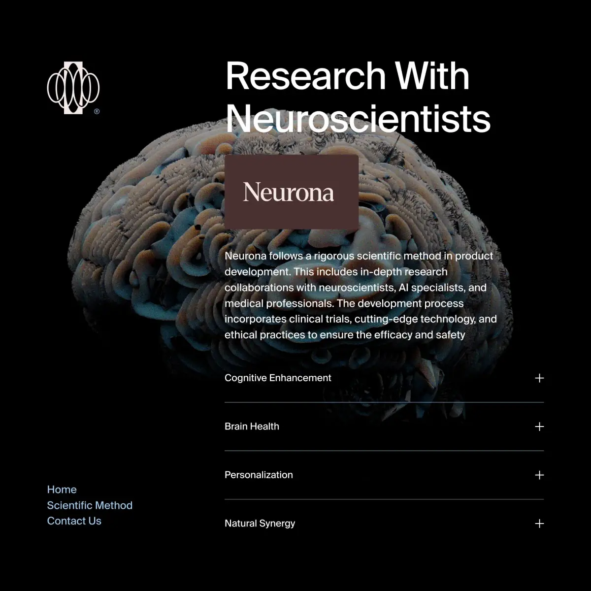
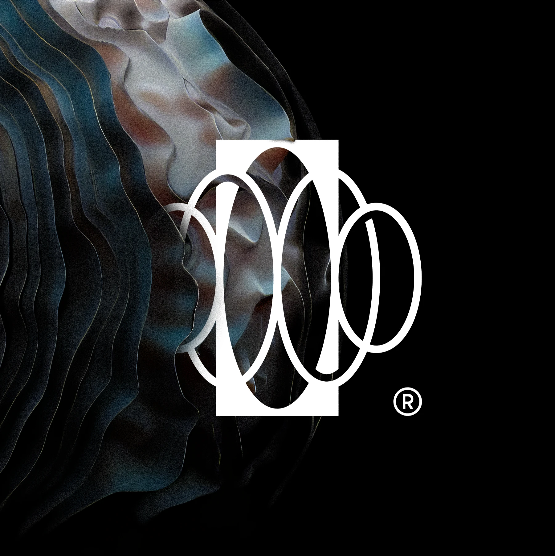
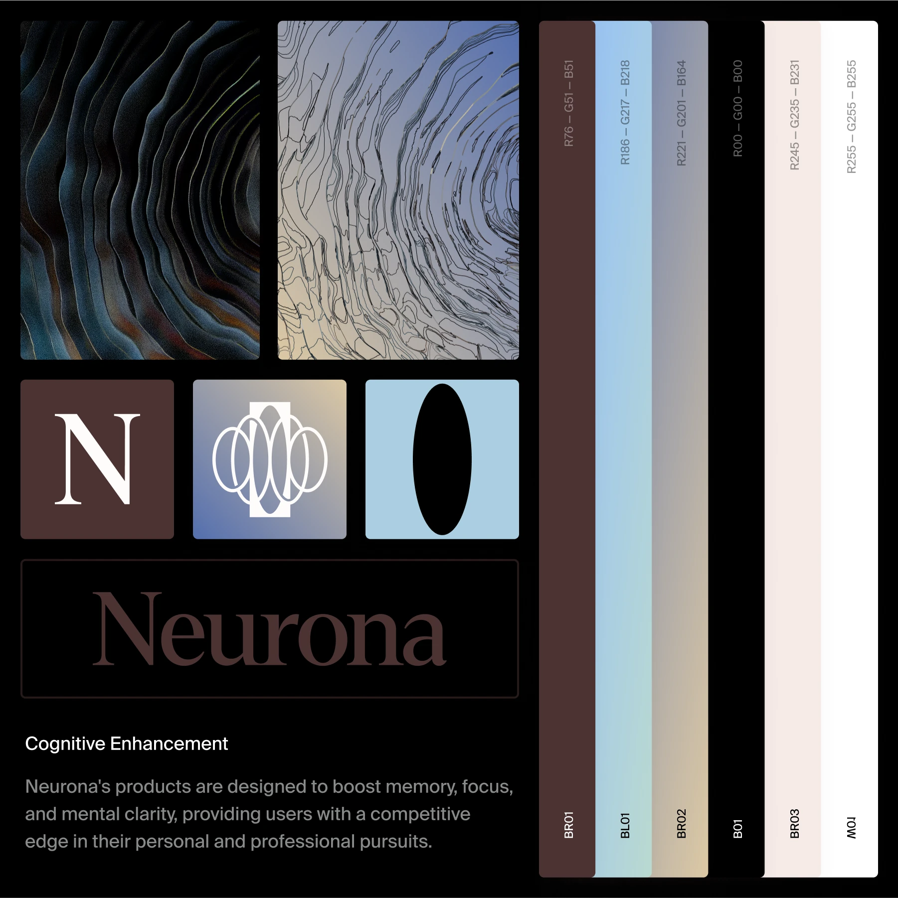
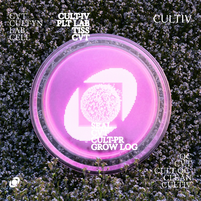
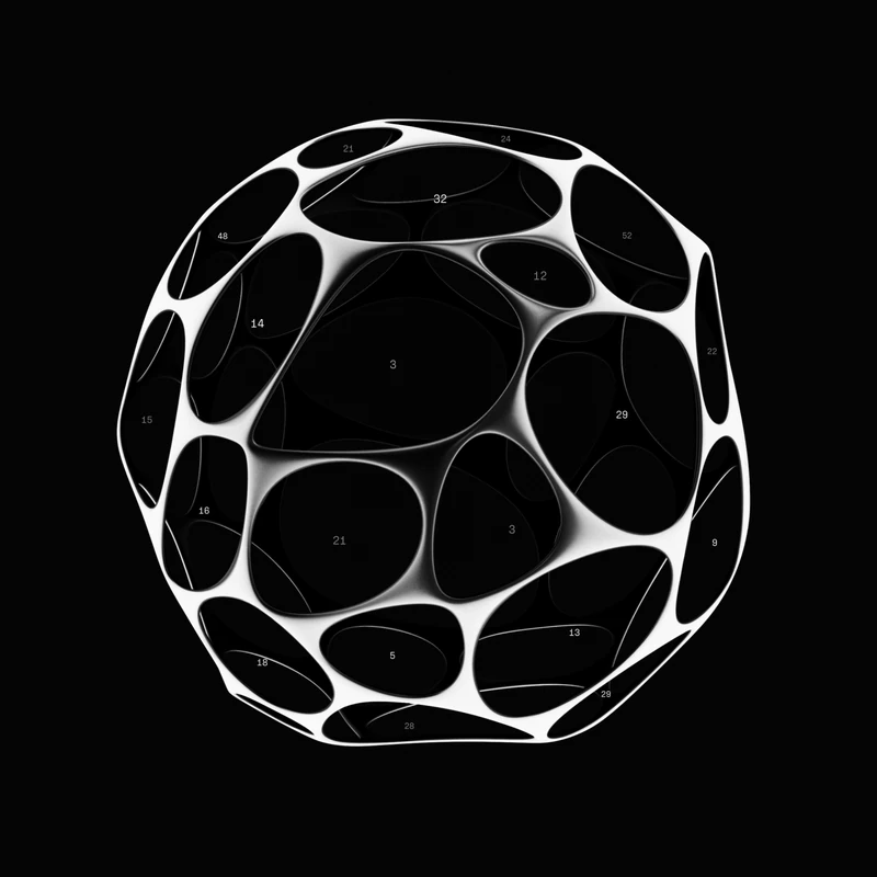
The brand draws on the fungal kingdom, which works in a similar way to Neurona's scientific method. The logo is an abstract brain made of connected circles, for neuroscience and data. The emphasis at the centre stands for targeted cognitive enhancement.
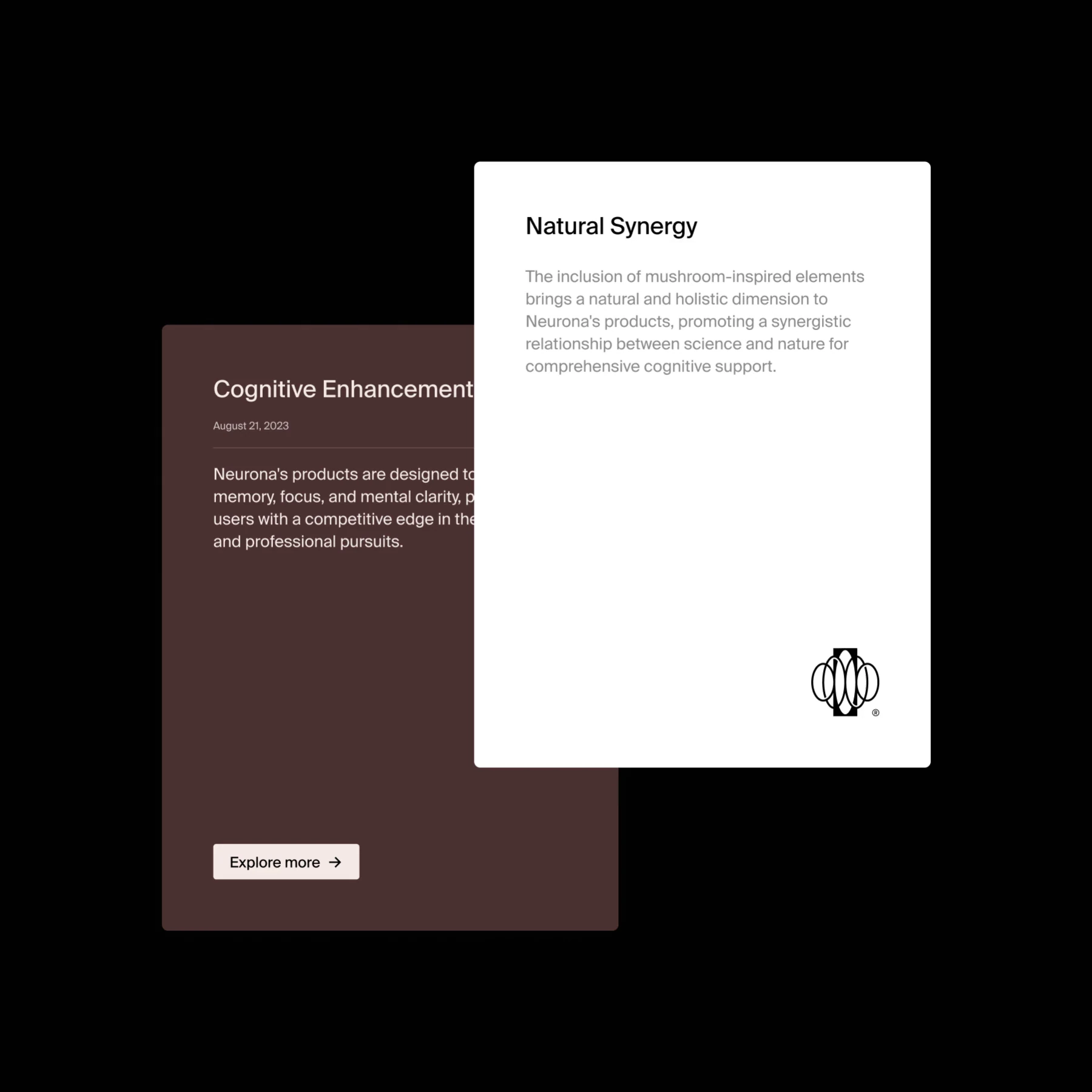
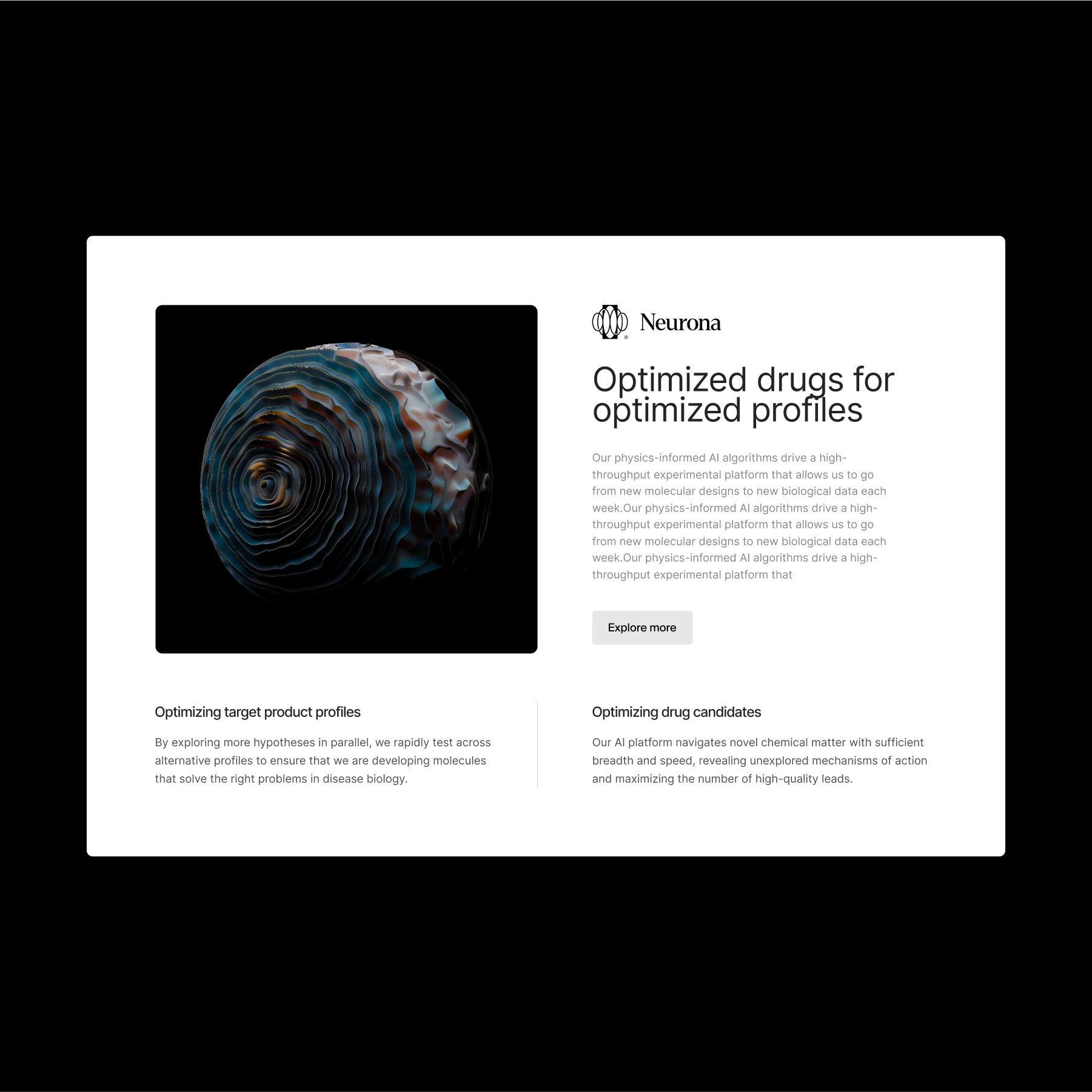
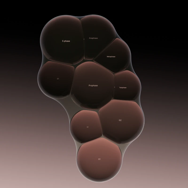
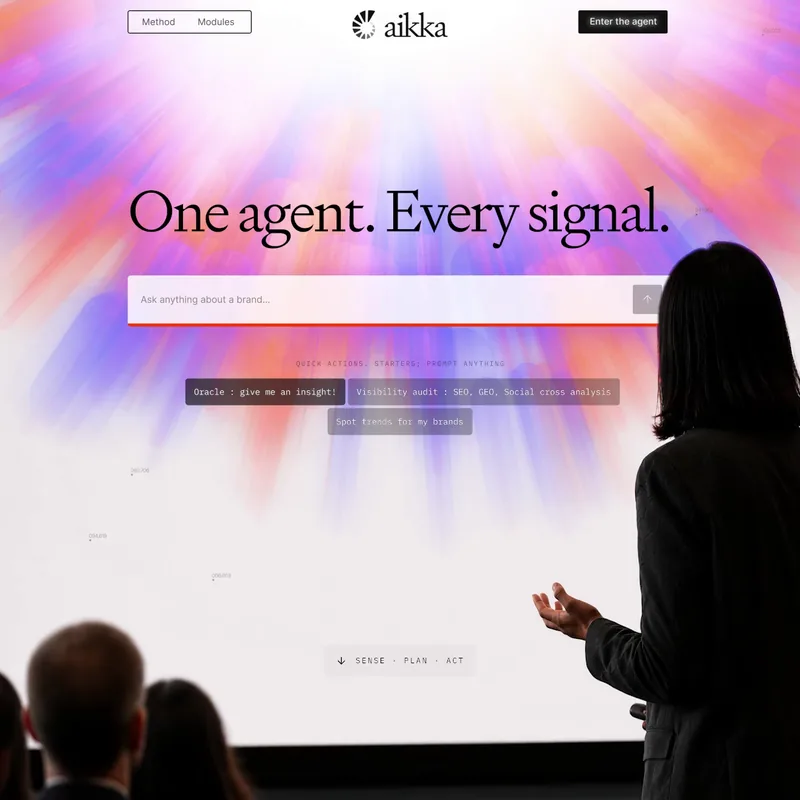
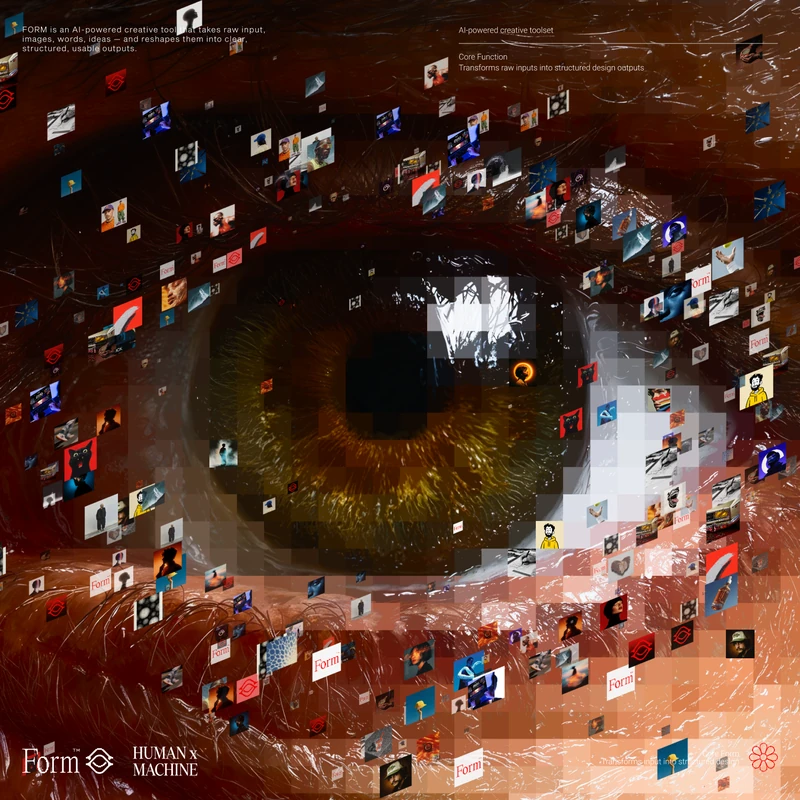
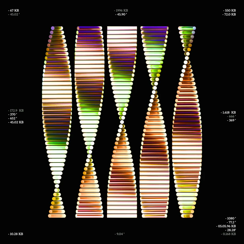
The UI is clean and easy to use, with strong layouts and typography. The palette is mostly brown and soft pastels. Animations are calm and subtle.
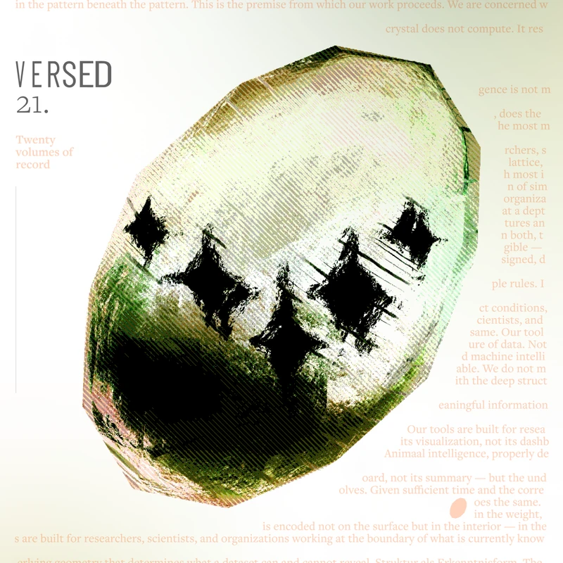
The overall look is clean, simple and friendly, with a slightly mysterious mood.